
CSS3 Buttons
CSS3 Buttons
In this tutorial, we’ll teach you how to use CSS3 buttons.
Example
<!DOCTYPE html>
<html>
<head>
<title>
CSS3 Buttons
</title>
<style>
.button {
background-color: dodgerblue;
border: none;
color: white;
cursor: pointer;
text-align: center;
padding: 20px 35px;
text-decoration: none;
display: inline-block;
margin: 10px 8px;
font-size: 25px;
}
</style>
</head>
<body>
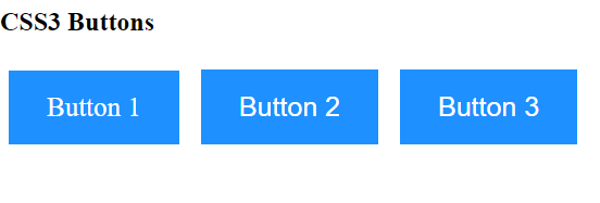
<h2>CSS3 Buttons</h2>
<a href="#" class="button">Button 1</a>
<button class="button">Button 2</button>
<input type="button" class="button" value="Button 3">
</body>
</html>
The output of this code will be
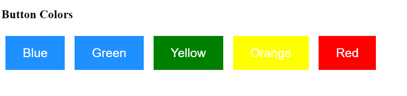
CSS3 Buttons Colors
We can change the background color of a button using the background-color property.
Example
<!DOCTYPE html>
<html>
<head>
    <title>
        CSS3 Buttons
    </title>
    <style>
        .button {
            background-color: dodgerblue;
            border: none;
            color: white;
            cursor: pointer;
            text-align: center;
            padding: 20px 35px;
            text-decoration: none;
            display: inline-block;
            margin: 10px 8px;
            font-size: 25px;
        }
        .button2 {
            background-color: green;
        }
        .button3 {
            background-color: yellow;
        }
        .button4 {
            background-color: red;
        }
    </style>
</head>
<body>
    <h2>Button Colors</h2>
    <button class="button">Blue</button>
    <button class="button button1">Green</button>
    <button class="button button2">Yellow</button>
    <button class="button button3">Orange</button>
    <button class="button button4">Red</button>
</body>
</html>
The output of this code will be
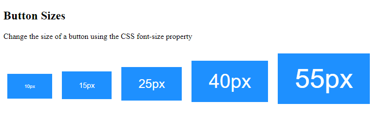
Button Sizes
We can specify the size of a button using the CSS font-size property.
Example
<!DOCTYPE html>
<html>
<head>
    <title>
        CSS3 Buttons
    </title>
    <style>
        .button {
            background-color: dodgerblue;
            border: none;
            color: white;
            cursor: pointer;
            text-align: center;
            padding: 20px 35px;
            text-decoration: none;
            display: inline-block;
            margin: 10px 8px;
            font-size: 25px;
        }
        .button1 {
            font-size: 10px;
        }
        .button2 {
            font-size: 15px;
        }
        .button3 {
            font-size: 25px;
        }
        .button4 {
            font-size: 40px;
        }
        .button5 {
            font-size: 55px;
        }
    </style>
</head>
<body>
    <h2>Button Sizes</h2>
    <p>Change the size of a button using the CSS font-size property</p>
    <button class="button button1">10px</button>
    <button class="button button2">15px</button>
    <button class="button button3">25px</button>
    <button class="button button4">40px</button>
    <button class="button button5">55px</button>
</body>
</html>
The output of this code will be
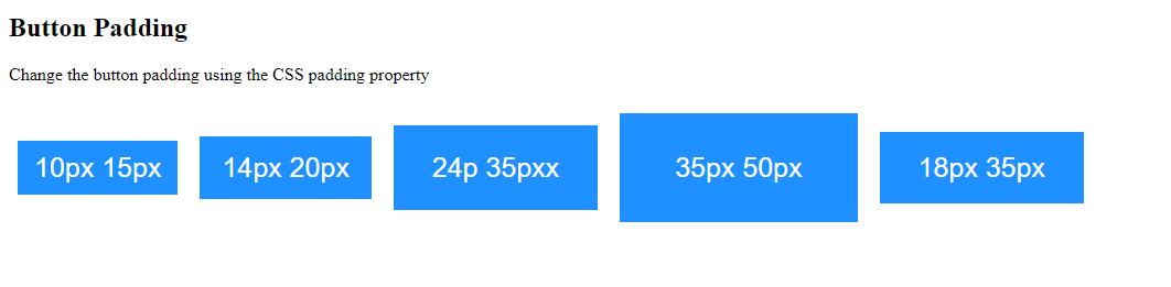
Use the padding property to specify the spacing between content and button border.
Example
<!DOCTYPE html>
<html>
<head>
    <title>
        CSS3 Buttons
    </title>
    <style>
        .button {
            background-color: dodgerblue;
            border: none;
            color: white;
            cursor: pointer;
            text-align: center;
            padding: 20px 35px;
            text-decoration: none;
            display: inline-block;
            margin: 10px 8px;
            font-size: 25px;
        }
        .button1 {
            padding: 10px 15px;
        }
        .button2 {
            padding: 14px 20px;
        }
        .button3 {
            padding: 24px 35px;
        }
        .button4 {
            padding: 35px 50px;
        }
        .button5 {
            padding: 18px 35px;
        }
    </style>
</head>
<body>
    <h2>Button Padding</h2>
    <p>Change the button padding using the CSS padding property</p>
    <button class="button button1">10px 15px</button>
    <button class="button button2">14px 20px</button>
    <button class="button button3">24p 35pxx</button>
    <button class="button button4">35px 50px</button>
    <button class="button button5">18px 35px</button>
</body>
</html>
The output of this code will be
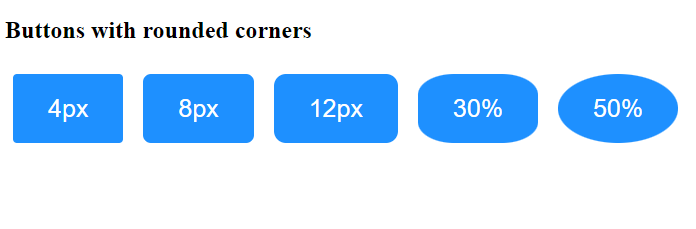
Rounded Buttons
Use the CSS ‘border-radius’ property to curve the corners of a button.
Example
<!DOCTYPE html>
<html>
<head>
    <style>
        .button {
            background-color: dodgerblue;
            border: none;
            color: white;
            cursor: pointer;
            text-align: center;
            padding: 20px 35px;
            text-decoration: none;
            display: inline-block;
            margin: 10px 8px;
            font-size: 25px;
        }
        .button1 {
            border-radius: 4px;
        }
        .button2 {
            border-radius: 8px;
        }
        .button3 {
            border-radius: 12px;
        }
        .button4 {
            border-radius: 30%;
        }
        .button5 {
            border-radius: 50%;
        }
    </style>
</head>
<body>
    <h2>Buttons with rounded corners</h2>
    <button class="button button1">4px</button>
    <button class="button button2">8px</button>
    <button class="button button3">12px</button>
    <button class="button button4">30%</button>
    <button class="button button5">50%</button>
</body>
</html>
The output of this code will be
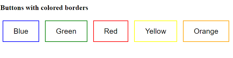
CSS3 Buttons with Colored Borders
Using the CSS3 border property, we can add a colored border to the buttons.
Example
<!DOCTYPE html>
<html>
<head>
    <style>
        .button {
            background-color: dodgerblue;
            border: none;
            color: white;
            cursor: pointer;
            text-align: center;
            padding: 20px 35px;
            text-decoration: none;
            display: inline-block;
            margin: 10px 8px;
            font-size: 25px;
        }
        .button1 {
            background-color: white;
            color: black;
            border: 2px solid blue;
        }
        .button2 {
            background-color: white;
            color: black;
            border: 2px solid green;
        }
        .button3 {
            background-color: white;
            color: black;
            border: 2px solid red;
        }
        .button4 {
            background-color: white;
            color: black;
            border: 2px solid yellow;
        }
        .button5 {
            background-color: white;
            color: black;
            border: 2px solid orange;
        }
    </style>
</head>
<body>
    <h2>Buttons with colored borders</h2>
    <button class="button button1">Blue</button>
    <button class="button button2">Green</button>
    <button class="button button3">Red</button>
    <button class="button button4">Yellow</button>
    <button class="button button5">Orange</button>
</body>
</html>
The output of this code will be
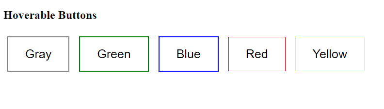
Hoverable CSS3 Buttons
Using the: selector, you can change the style of a button when the user mouses over it. Moreover, you can use the CSS property ‘transition duration’ to specify the speed of the hover effect.
Example
<!DOCTYPE html>
<html>
<head>
    <style>
        .button {
            background-color: dodgerblue;
            border: none;
            color: white;
            cursor: pointer;
            text-align: center;
            padding: 20px 35px;
            text-decoration: none;
            display: inline-block;
            margin: 10px 8px;
            font-size: 25px;
        }
        .button1 {
            background-color: white;
            color: black;
            border: 2px solid gray;
        }
        .button1:hover {
            background-color: gray;
            color: white;
        }
        .button2 {
            background-color: white;
            color: black;
            border: 2px solid green;
        }
        .button2:hover {
            background-color: green;
            color: white;
        }
        .button3 {
            background-color: white;
            color: black;
            border: 2px solid blue;
        }
        .button3:hover {
            background-color: blue;
            color: white;
        }
        .button4 {
            background-color: white;
            color: black;
            border: 1px solid red;
        }
        .button4:hover {
            background-color: red;
            color: white;
        }
        .button5 {
            background-color: white;
            color: black;
            border: 1px solid yellow;
        }
        .button5:hover {
            background-color: yellow;
            color: white;
        }
    </style>
</head>
<body>
    <h2>Hoverable Buttons</h2>
    <button class="button button1">Gray</button>
    <button class="button button2">Green</button>
    <button class="button button3">Blue</button>
    <button class="button button4">Red</button>
    <button class="button button5">Yellow</button>
</body>
</html>
The output of this code will be
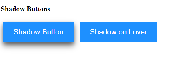
Shadow Buttons
Using the CSS box-shadow property, we can apply shadows to CSS3 buttons.
Example
<!DOCTYPE html>
<html>
<head>
    <style>
        .button {
            background-color: dodgerblue;
            border: none;
            color: white;
            cursor: pointer;
            text-align: center;
            padding: 20px 35px;
            text-decoration: none;
            display: inline-block;
            margin: 10px 8px;
            font-size: 25px;
        }
        .button1 {
            box-shadow: 0 12px 20px 0 rgba(0, 0, 0, 0.5), 0 8px 12px 0 rgba(0, 0, 0, 0.25);
        }
        .button2:hover {
            box-shadow: 0 12px 20px 0 rgba(0, 0, 0, 0.5), 0 8px 12px 0 rgba(0, 0, 0, 0.45);
        }
    </style>
</head>
<body>
    <h2>Shadow Buttons</h2>
    <button class="button button1">Shadow Button</button>
    <button class="button button2">Shadow on hover</button>
</body>
</html>
The output of this code will be
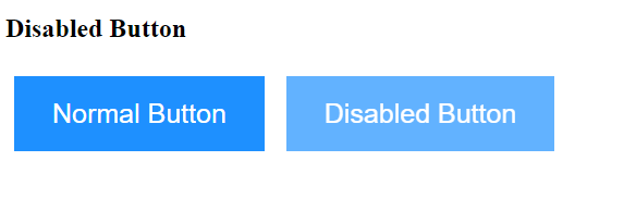
Disabled CSS3 Buttons
Using the CSS opacity property, we can add opacity to the button. To make a disabled button, you should assign the value ‘not-allowed’ to the CSS cursor property.
Eventually, you’ll see a “no parking sign” when you mouse over the button.
Example
<!DOCTYPE html>
<html>
<head>
    <style>
        .button {
            background-color: dodgerblue;
            border: none;
            color: white;
            cursor: pointer;
            text-align: center;
            padding: 20px 35px;
            text-decoration: none;
            display: inline-block;
            margin: 10px 8px;
            font-size: 25px;
        }
        .disabled {
            opacity: 0.7;
            cursor: not-allowed;
        }
    </style>
</head>
<body>
    <h2>Disabled Button</h2>
    <button class="button">Normal Button</button>
    <button class="button disabled">Disabled Button</button>
</body>
</html>
The output of this code will be
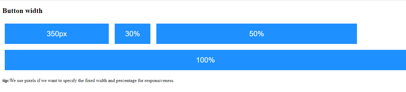
CSS3 Buttons Width
By default, button width depends on the content it contains. Using the CSS width property, you can change the button’s width.
Example
<!DOCTYPE html>
<html>
<head>
    <style>
        .button {
            background-color: dodgerblue;
            border: none;
            color: white;
            cursor: pointer;
            text-align: center;
            padding: 20px 35px;
            text-decoration: none;
            display: inline-block;
            margin: 10px 8px;
            font-size: 25px;
        }
        .button1 {
            width: 350px;
        }
        .button2 {
            width: 305;
        }
        .button3 {
            width: 50%;
        }
        .button4 {
            width: 100%;
        }
    </style>
</head>
<body>
    <h2>Button width</h2>
    <button class="button button1">350px</button>
    <button class="button button2">30%</button>
    <button class="button button3">50%</button>
    <button class="button button4">100%</button>
    <p><strong>tip:</strong>We use pixels if we want to specify the fixed width and percentage for responsiveness.</p>
</body>
</html>
The output of this code will be
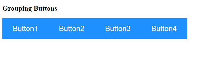
Button Groups
Remove the default margin from the button and add the CSS float property for grouping buttons.
Example
<!DOCTYPE html>
<html>
<head>
    <style>
        .button {
            background-color: dodgerblue;
            border: none;
            color: white;
            cursor: pointer;
            text-align: center;
            padding: 20px 35px;
            text-decoration: none;
            display: inline-block;
            margin: 10px 8px;
            font-size: 25px;
            float: left;
        }
        .btn-group .button:hover {
            background-color: aquamarine;
        }
    </style>
</head>
<body>
    <h2>Grouping Buttons</h2>
    <div class="btn-group">
        <button class="button">Button1</button>
        <button class="button">Button2</button>
        <button class="button">Button3</button>
        <button class="button">Button4</button>
    </div>
</body>
</html>
The output of this code will be
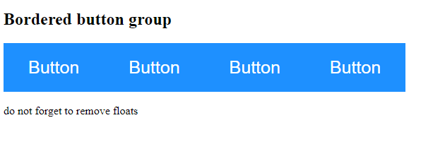
Bordered CSS3 Buttons Group
Using the CSS3 border property, we can create a bordered button group.
Example
<!DOCTYPE html>
<html>
<head>
    <style>
        .btn-group .button {
            background-color: dodgerblue;
            border: none;
            color: white;
            cursor: pointer;
            text-align: center;
            padding: 20px 35px;
            text-decoration: none;
            display: inline-block;
            font-size: 25px;
            float: left;
        }
        .btn-group .button:not(:last-child) {
            border-right: none;
            /* prevent double border*/
        }
        .btn-group .button:hover {
            background-color: aquamarine;
        }
    </style>
</head>
<body>
    <h2>Bordered button group</h2>
    <div class="btn-group">
        <button class="button">Button</button>
        <button class="button">Button</button>
        <button class="button">Button</button>
        <button class="button">Button</button>
    </div>
    <p style="clear:both"><br>do not forget to remove floats</p>
</body>
</html>
The output of this code will be
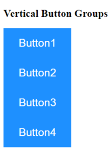
Vertical Button Groups
Assign the value ‘block’ to the CSS display property to vertically group the buttons.
Example
<!DOCTYPE html>
<html>
<head>
 <style>
   .button{
     background-color: dodgerblue;
     border: none;
     color: white;
     cursor: pointer;
     text-align: center;
     padding: 20px 35px;
     text-decoration: none;
     display: inline-block;
     font-size: 25px;
     display: block;
   }
   .btn-group .button:not(:last-child){
     border-bottom: none;
   }
   .btn-group .button:hover{
     background-color: aquamarine;
   }
  </style>
</head>
<body>
 <h2>Vertical Button Groups</h2>
 <div class="btn-group">
  <button class="button">Button1</button>
  <button class="button">Button2</button>
  <button class="button">Button3</button>
  <button class="button">Button4</button>
</div>
</body>
</html>
The output of this code will be
Continue learning more.
External Sources
https://developer.mozilla.org/css buttons