
CSS3 Gradients
CSS3 Gradients
With CSS3 Gradients, you can display smooth transitions with an aid of two or more specified colors.
How to Define CSS3 Gradients?
To define liner gradients, you must have to define two color stops. From the web design standpoint, color stops are the colors you want to apply transitions.
While defining gradient, you can use starting point and direction along with the gradient effect.
Syntax of CSS3 Gradients
background-image: linear-gradient(direction, color-step1, color-step2, ……);
Direction – Top to Bottom (this is Default)
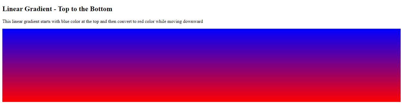
The below-mentioned example demonstrates a linear gradient that begins at the top. It begins with the blue color and then transitions to the red color.
Example
<!DOCTYPE html>

<html>

<head>

    <title>

        CSS3 Gradients

    </title>

  <style>

      #grad1{

          background-color: blue; /* for those browsers that do not support gradient*/

          height: 250px;

          background-image: linear-gradient(blue, red);

        }

    </style>

</head>

<body>

    <h2>Linear Gradient - Top to the Bottom</h2>

    <p>This linear gradient starts with blue color at the top and then convert to

        red color while moving downward

    </p>

    <div id="grad1"></div>

</body>

</html>
The output of this code will be
Direction – Left to Right
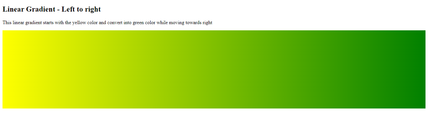
The following example demonstrates a linear gradient that starts from the left. It starts with yellow and gradually convert into green while moving towards the right.
Example
<!DOCTYPE html>

<html>

<head>

    <title>

        CSS3 Gradients

    </title>

  <style>

      #grad1{

          background-color: blue; /* for those browsers that do not support gradient*/

          height: 250px;

          background-image:linear-gradient(to right,yellow, green);

        }

    </style>

</head>

<body>

    <h2>Linear Gradient - Left to right</h2>

    <p>This linear gradient starts with the yellow color and convert into green color

        while moving towards right

    </p>

    <div id="grad1"></div>

</body>

</html>
The output of this code will be
Direction – Diagonal
Similarly, you can make a diagonal dimension by defining both the vertical and horizontal starting points.
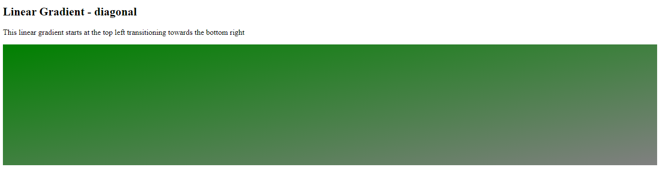
The below-mentioned example shows a diagonal gradient that starts at the top left and goes towards the bottom right. It starts at the green and converts into grey while moving towards the bottom right.
Example
<!DOCTYPE html>

<html>

<head>

    <title>

        CSS3 Gradients

    </title>

  <style>

      #grad1{

          background-color: grrn; /* for those browsers that do not support gradient*/

          height: 250px;

          background-image:linear-gradient(to bottom right,green, grey);

        }

    </style>

</head>

<body>

    <h2>Linear Gradient - diagonal</h2>

    <p>This linear gradient starts at the top left transitioning towards the bottom right

    </p>

    <div id="grad1"></div>

</body>

</html>
The output of this code will be
Using an Angle
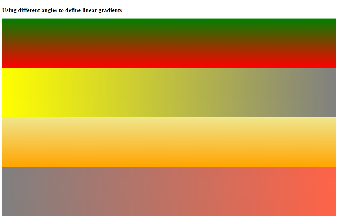
If you want complete control over the direction of the gradient, you can use angle rather than direction (to right, to left, to top, to bottom, to bottom right, etc.)
The value of “0deg” represents “to top.” A value of ‘90deg’ represents ‘to right.’ A value of ‘180deg’ represents ‘to bottom.’
The syntax for CSS Gradients with Angles
background-image: linear-gradient(angle, color-stop1, color-stop2);
The below-mentioned example shows how to define linear gradients with angles.
Example
<!DOCTYPE html>

<html>

<head>

    <title>

        CSS3 Gradients

    </title>

  <style>

      #grad1{

          background-color: grrn; /* for those browsers that do not support gradient*/

          height: 200px;

          background-image:linear-gradient(0deg, red, green);

        }

        #grad2{

            background-color: blue; /* for those browsers that do not support gradient */

            height: 200px;

            background-image: linear-gradient(90deg, yellow, grey);

        }

        #grad3{

            background-color: blue; /* for those browsers that do not support gradient */

            height: 200px;

            background-image: linear-gradient(180deg, khaki, orange);

        }

        #grad4{

            background-color: blue; /* for those browsers that do not support gradient */

            height: 200px;

            background-image: linear-gradient(-90deg, tomato, grey);

        }

    </style>

</head>

<body>

    <h2>Using different angles to define linear gradients</h2>

    <div id="grad1"></div>

    <div id="grad2"></div>

    <div id="grad3"></div>

    <div id="grad4"></div>

</body>

</html>
The output of this code will be
Using Multiple Color Stops to Define Gradients
The below-mentioned example shows linear gradient (from top to bottom) with many color stops.
Example
<!DOCTYPE html>

<html>

<head>

    <title>

        CSS3 Gradients

    </title>

  <style>

        #grad1{

            background-color: red; /* for those browsers that do not support gradient */

            height: 90px;

            background-image: linear-gradient(to right,red,orange, yellow, green, blue, indigo, violet);

        }

    </style>

</head>

<body>

  <div id="grad1" style="text-align: center; font-family: bold; font-size: 60px; margin: auto;

  color: gray;">
Rainbow background
</div>

</body>

</html>
The output of this code will be

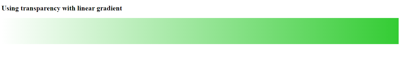
Applying Transparency to Gradients
CSS3 gradients can create transparency that could create a fading effect. To define transparency, we use rgba() function. The value assigns to rgba() function ranges from 0 to 1. 0 means full transparency whereas 1 means full color with no transparency.
Example
<!DOCTYPE html>

<html>

<head>

    <title>

        CSS3 Gradients

    </title>

  <style>

        #grad1{

            background-color: green; /* for those browsers that do not support gradient */

            height: 90px;

            background-image: linear-gradient(to right, rgba(51, 204, 51,0), rgba(51, 204, 51,1));

        }

    </style>

</head>

<body>

 <h2>Using transparency with linear gradient</h2>

 <div id="grad"></div>

</body>

</html>
The output of this code will be
Previous Lesson
https://developer.mozilla.org/en-US/docs/Web/CSS/gradient/linear-gradient()