
CSS3 Grid Layout
CSS3 Grid Layout
CSS3 grid layout is a grid-based layout system that comes with rows and columns. They allow you to design web pages without using floats and positioning.
Browsers Support for CSS3 Grid Layout
Below is the list of browsers that fully supports the CSS3 grid-based layout.
- Google Chrome 57.0
- Microsoft Edge 16.0
- Firefox 52.0
- Safari 10
- Opera 44
CSS3 Grid Layout Elements
Grid layout element comprises parent element coupled with one or two child elements.
Example
<!DOCTYPE html>
<html>
<head>
<title>
CSS3 Grid Layout Module
</title>
<style>
.grid-container {
display: grid;
grid-template-columns: auto auto auto;
background-color: orange;
padding: 20px;
}
.grid-item {
background-color: rgba(0, 255, 0, 0.7);
border: 1px solid rgba(255, 0, 0, 0.8);
padding: 25px;
font-size: 45px;
text-align: center;
}
</style>
</head>
<body>
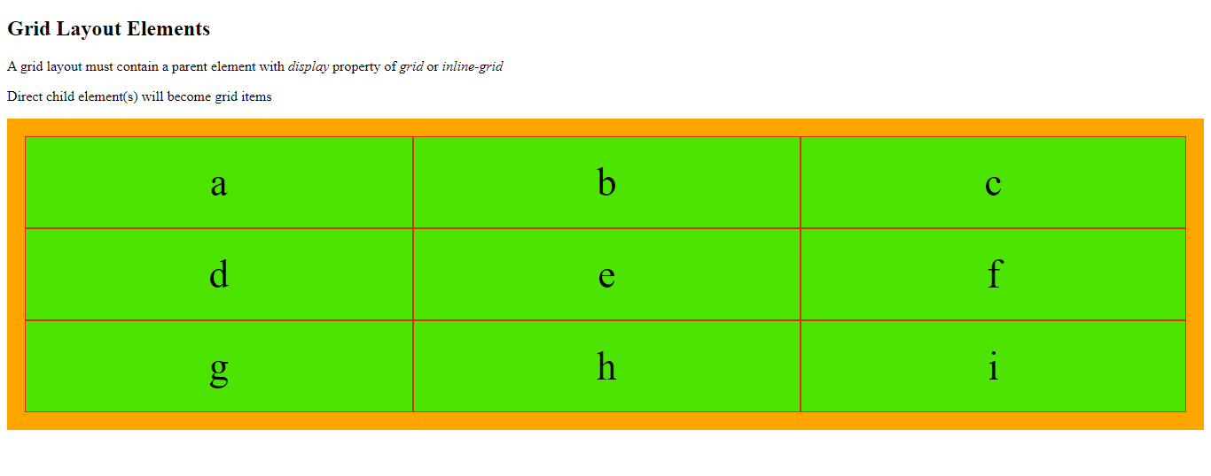
<h2>Grid Layout Elements</h2>
<p>A grid layout must contain a parent element with <em>display</em> property of <em>grid</em>
or <em>inline-grid</em> </p>
<p>Direct child element(s) will become grid items</p>
<div class="grid-container">
<div class="grid-item">a</div>
<div class="grid-item">b</div>
<div class="grid-item">c</div>
<div class="grid-item">d</div>
<div class="grid-item">e</div>
<div class="grid-item">f</div>
<div class="grid-item">g</div>
<div class="grid-item">h</div>
<div class="grid-item">i</div>
</div>
</body>
</html>
The output of this code will be
Example
<!DOCTYPE html>
<html>
<head>
<title>
CSS3 Grid Layout Module
</title>
<style>
.grid-container {
display: inline-grid;
grid-template-columns: auto auto auto;
background-color: orange;
padding: 20px;
}
.grid-item {
background-color: rgba(0, 255, 0, 0.7);
border: 1px solid rgba(255, 0, 0, 0.8);
padding: 25px;
font-size: 45px;
text-align: center;
}
</style>
</head>
<body>
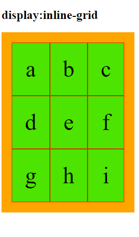
<h2>display:inline-grid</h2>
<div class="grid-container">
<div class="grid-item">a</div>
<div class="grid-item">b</div>
<div class="grid-item">c</div>
<div class="grid-item">d</div>
<div class="grid-item">e</div>
<div class="grid-item">f</div>
<div class="grid-item">g</div>
<div class="grid-item">h</div>
<div class="grid-item">i</div>
</div>
</body>
</html>
The output of this code will be
Grid Columns
From the web design standpoint, grid columns are the vertical lines of grid items.
Grid Rows
Grid rows are the horizontal lines of grid items.
Grid Gaps
The space between the two successive rows/columns are grid gaps.
You can specify the grid-gap by using one of the following properties.
- grid-column-gap
- grid-row-gap
- grid-gap
Example
<!DOCTYPE html>
<html>
<head>
<style>
.grid-container {
display: grid;
grid-column-gap: 45px;
grid-template-columns: auto auto auto;
background-color: orange;
padding: 20px;
}
.grid-item {
background-color: rgba(0, 255, 0, 0.7);
border: 1px solid rgba(255, 0, 0, 0.8);
padding: 25px;
font-size: 45px;
text-align: center;
}
</style>
</head>
<body>
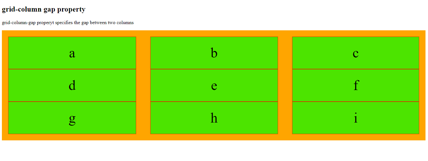
<h2>grid-column gap property</h2>
<p>grid-column-gap properyt specifies the gap between two columns</p>
<div class="grid-container">
<div class="grid-item">a</div>
<div class="grid-item">b</div>
<div class="grid-item">c</div>
<div class="grid-item">d</div>
<div class="grid-item">e</div>
<div class="grid-item">f</div>
<div class="grid-item">g</div>
<div class="grid-item">h</div>
<div class="grid-item">i</div>
</div>
</body>
</html>
The output of this code will be
Example
<!DOCTYPE html>
<html>
<head>
<style>
.grid-container {
display: grid;
grid-row-gap: 55px;
grid-template-columns: auto auto auto;
background-color: orange;
padding: 20px;
}
.grid-item {
background-color: rgba(0, 255, 0, 0.7);
border: 1px solid rgba(255, 0, 0, 0.8);
padding: 25px;
font-size: 45px;
text-align: center;
}
</style>
</head>
<body>
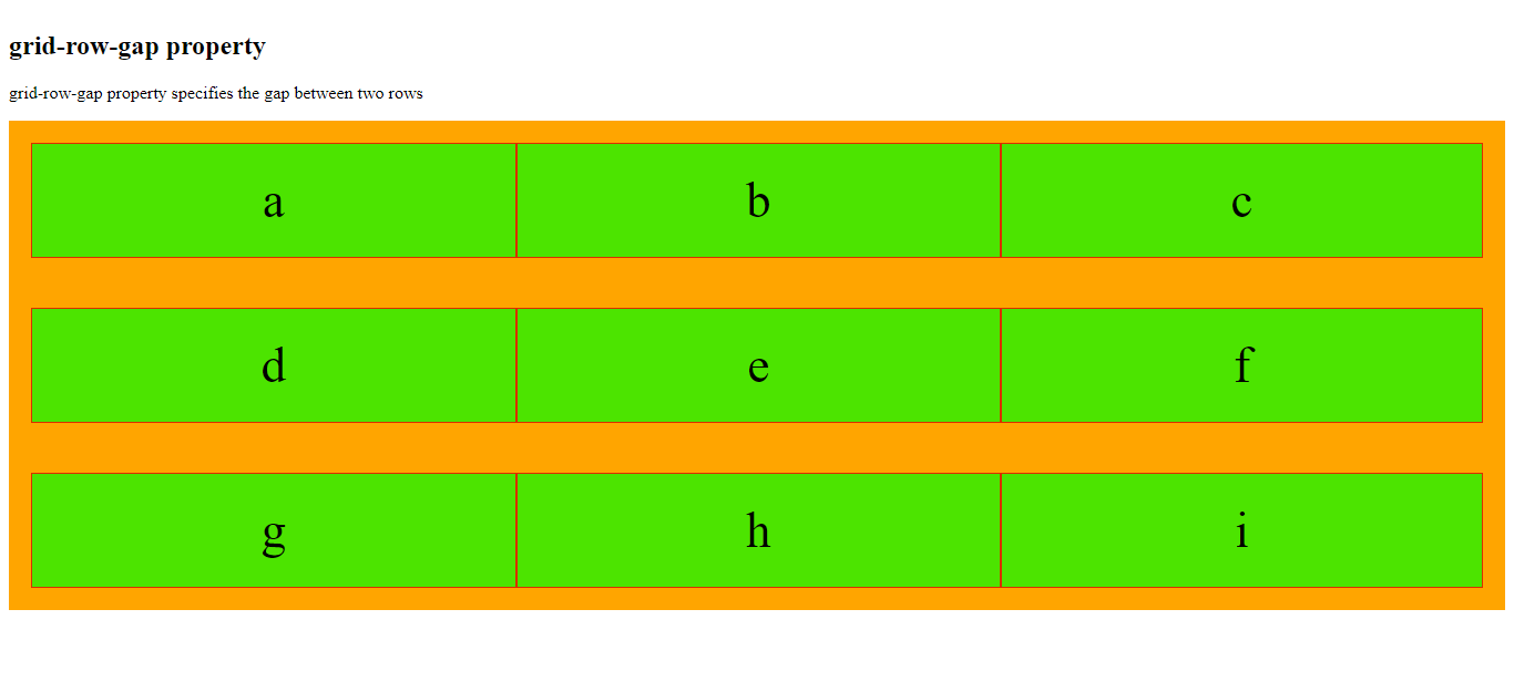
<h2>grid-row-gap property</h2>
<p>grid-row-gap property specifies the gap between two rows</p>
<div class="grid-container">
<div class="grid-item">a</div>
<div class="grid-item">b</div>
<div class="grid-item">c</div>
<div class="grid-item">d</div>
<div class="grid-item">e</div>
<div class="grid-item">f</div>
<div class="grid-item">g</div>
<div class="grid-item">h</div>
<div class="grid-item">i</div>
</div>
</body>
</html>
The output of this code will be
Example
<!DOCTYPE html>
<html>
<head>
<style>
.grid-container {
display: grid;
grid-gap: 35px;
grid-template-columns: auto auto auto;
background-color: orange;
padding: 20px;
}
.grid-item {
background-color: rgba(0, 255, 0, 0.7);
border: 1px solid rgba(255, 0, 0, 0.8);
padding: 25px;
font-size: 45px;
text-align: center;
}
</style>
</head>
<body>
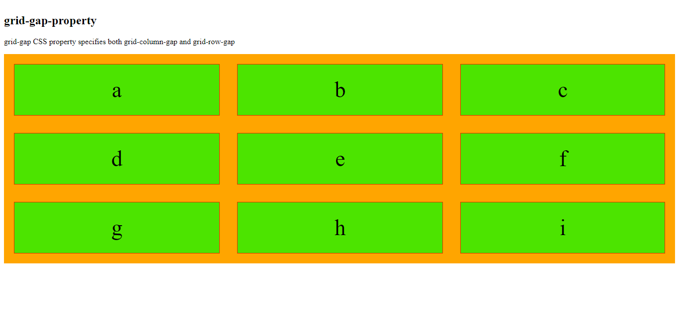
<h2>grid-gap-property</h2>
<p>grid-gap CSS property specifies both grid-column-gap and grid-row-gap </p>
<div class="grid-container">
<div class="grid-item">a</div>
<div class="grid-item">b</div>
<div class="grid-item">c</div>
<div class="grid-item">d</div>
<div class="grid-item">e</div>
<div class="grid-item">f</div>
<div class="grid-item">g</div>
<div class="grid-item">h</div>
<div class="grid-item">i</div>
</div>
</body>
</html>
The output of this code will be
Example
<!DOCTYPE html>
<html>
<head>
<title>
CSS3 Grid Layout Module
</title>
<style>
.grid-container {
display: grid;
grid-gap: 45px;
grid-template-columns: auto auto auto;
background-color: orange;
padding: 20px;
}
.grid-item {
background-color: rgba(0, 255, 0, 0.7);
border: 1px solid rgba(255, 0, 0, 0.8);
padding: 25px;
font-size: 45px;
text-align: center;
}
</style>
</head>
<body>
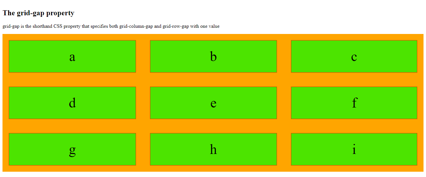
<h2> The grid-gap property</h2>
<p>grid-gap is the shorthand CSS property that specifies both grid-column-gap and grid-row-gap with one value </p>
<div class="grid-container">
<div class="grid-item">a</div>
<div class="grid-item">b</div>
<div class="grid-item">c</div>
<div class="grid-item">d</div>
<div class="grid-item">e</div>
<div class="grid-item">f</div>
<div class="grid-item">g</div>
<div class="grid-item">h</div>
<div class="grid-item">i</div>
</div>
</body>
</html>
The output of this code will be
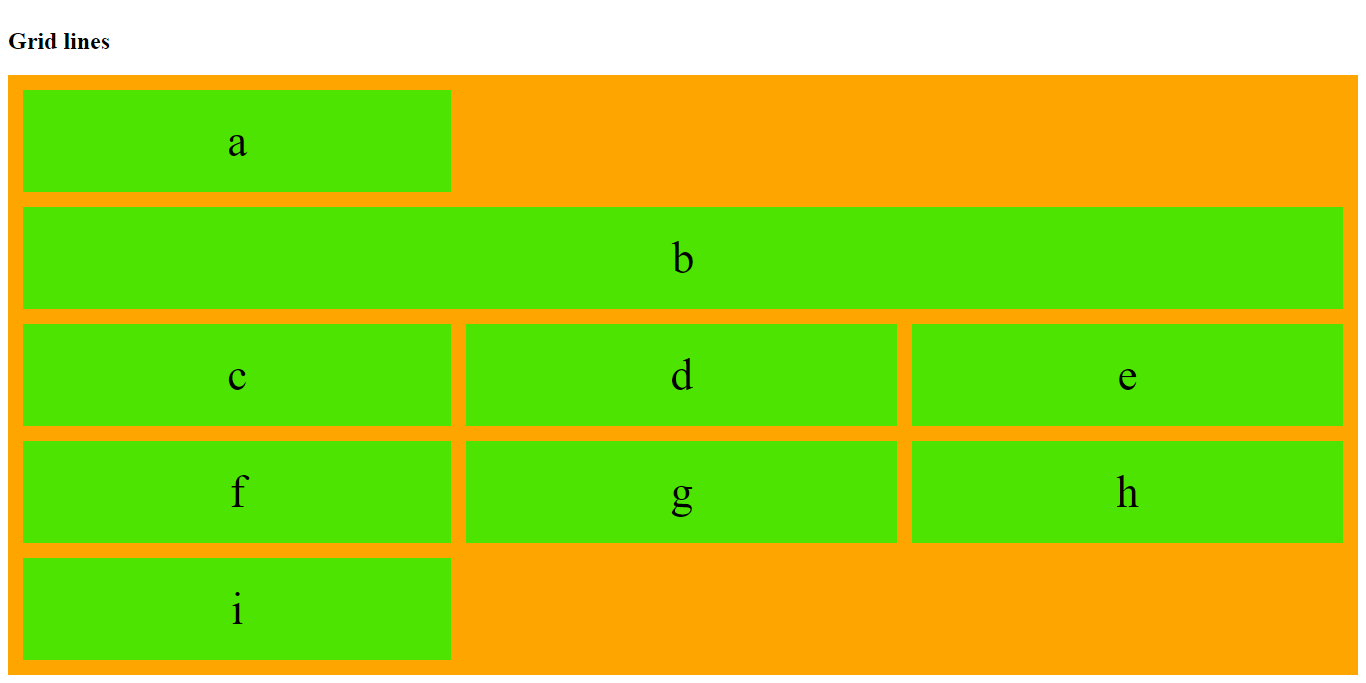
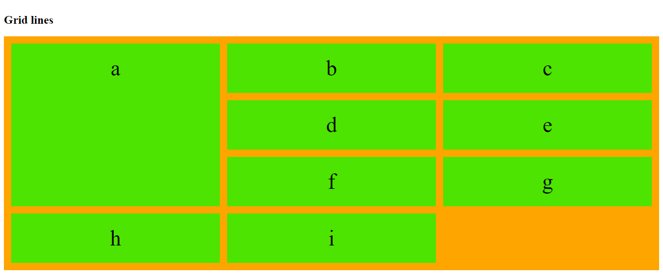
Grid Lines
Column lines are the line between the two columns. On the other hand, row lines are the lines between the two rows.
Example
In the below-mentioned example, the grid item starts at column line 1 and end at column line 2.
<!DOCTYPE html>
<html>
<head>
    <title>
        CSS3 Grid Layout Module
    </title>
    <style>
        .grid-container {
            padding: 15px;
            display: grid;
            grid-gap: 15px;
            grid-template-columns: auto auto auto;
            background-color: orange;
        }
        .grid-container>div {
            background-color: rgba(0, 255, 0, 0.7);
            padding: 25px 0;
            font-size: 45px;
            text-align: center;
        }
        .item {
            grid-column-start: 1;
            grid-column-end: 4;
        }
    </style>
</head>
<body>
    <h2> Grid lines </h2>
    <div class="grid-container">
        <div class="item1">a</div>
        <div class="item2">b</div>
        <div class="item3">c</div>
        <div class="item4">d</div>
        <div class="item5">e</div>
        <div class="item6">f</div>
        <div class="item7">g</div>
        <div class="item8">h</div>
        <div class="item9">i</div>
    </div>
</body>
</html>
The output of this code will be
Example
<!DOCTYPE html>
<html>
<head>
    <title>
        CSS3 Grid Layout Module
    </title>
    <style>
        .grid-container {
            padding: 15px;
            display: grid;
            grid-gap: 15px;
            grid-template-columns: auto auto auto;
            background-color: orange;
        }
        .grid-container>div {
            background-color: rgba(0, 255, 0, 0.7);
            padding: 25px 0;
            font-size: 45px;
            text-align: center;
        }
        .item1 {
            grid-row-start: 1;
            grid-row-end: 4;
        }
    </style>
</head>
<body>
    <h2> Grid lines </h2>
    <div class="grid-container">
        <div class="item1">a</div>
        <div class="item2">b</div>
        <div class="item3">c</div>
        <div class="item4">d</div>
        <div class="item5">e</div>
        <div class="item6">f</div>
        <div class="item7">g</div>
        <div class="item8">h</div>
        <div class="item9">i</div>
    </div>
</body>
</html>
The output of this code will be
Previous Lesson
External Sources
https://developer.mozilla.org/en-US/docs/Web/CSS/CSS_Grid_Layout