
CSS3 Grid Item
CSS3 Grid Item
A grid container comprises grid items. In this tutorial, we’ll teach different properties of the CSS3 grid item. By default, a grid container containers one grid item for each row and column.
However, you can apply your own styles to grid items so they can occupy multiple columns/rows.
The Grid-Column Property
The ‘grid-column’ specifies the number of columns the grid item will take. Moreover, with this CSS property, you can specify where an item will start and where will it end.
Technically speaking, ‘grid-column’ is a shorthand property to define both grid-column-start and grid-column-end CSS properties.
To specify the location of an item, you can use line numbers or the keyword span that defines how many columns an item will occupy.
Example of CSS3 Grid
<!DOCTYPE html>
<html>
<head>
<title>
CSS3 Grid Item
</title>
<style>
.grid-container {
padding: 10px;
display: grid;
grid-gap: 25px;
grid-template-columns: auto auto auto auto;
background-color: darkseagreen
}
.grid-container>div {
background-color: rgba(20, 0, 255, 0.7);
padding: 25px 0;
font-size: 45px;
text-align: center;
}
.item2 {
grid-column: 1/4;
}
</style>
</head>
<body>
<h2> The grid-column Property </h2>
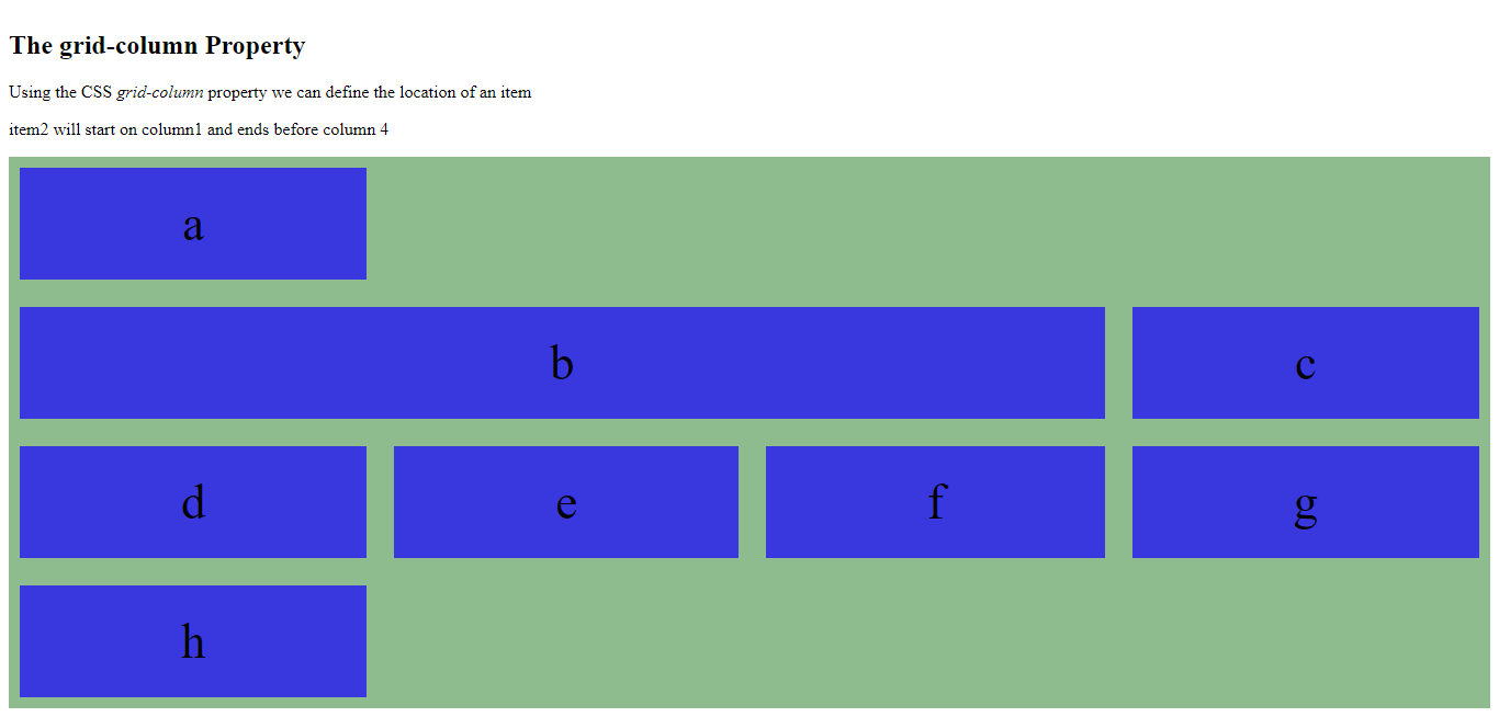
<p>Using the CSS <em>grid-column</em> property we can define the location of an item </p>
<p>item2 will start on column1 and ends before column 4</p>
<div class="grid-container">
<div class="item1">a</div>
<div class="item2">b</div>
<div class="item3">c</div>
<div class="item4">d</div>
<div class="item5">e</div>
<div class="item6">f</div>
<div class="item7">g</div>
<div class="item8">h</div>
</div>
</body>
</html>
The output of this code will be
Example of CSS3 Grid Item
Item1 starts on column 1 and span 4 columns.
<!DOCTYPE html>
<html>
<head>
<title>
CSS3 Grid Item
</title>
<style>
.grid-container {
padding: 10px;
display: grid;
grid-gap: 25px;
grid-template-columns: auto auto auto auto;
background-color: goldenrod;
}
.grid-container>div {
background-color: rgba(250, 0, 255, 0.7);
padding: 25px 0;
font-size: 45px;
text-align: center;
}
.item1 {
grid-column: 2 / span 3;
}
</style>
</head>
<body>
<h2> The grid-column Property </h2>
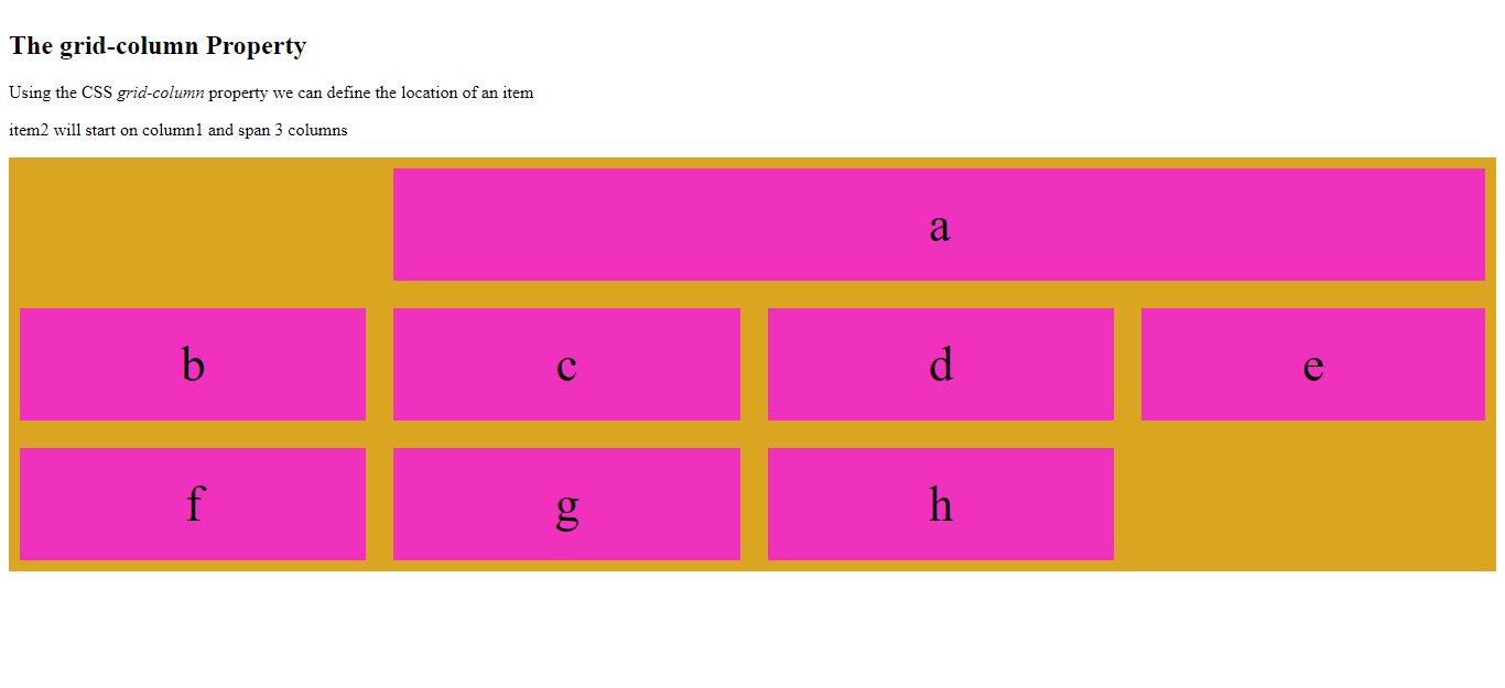
<p>Using the CSS <em>grid-column</em> property we can define the location of an item </p>
<p>item2 will start on column1 and span 4 columns</p>
<div class="grid-container">
<div class="item1">a</div>
<div class="item2">b</div>
<div class="item3">c</div>
<div class="item4">d</div>
<div class="item5">e</div>
<div class="item6">f</div>
<div class="item7">g</div>
<div class="item8">h</div>
</div>
</body>
</html>
The output of this code will be
The Grid-Row Property
CSS3 ‘grid-row’ property defines how many rows the grid item will occupy. Moreover, with this property, you can define where an item will start and where it will end.
To place an item, we can use a line number or the keyword ‘span’ to specify how many rows an item will occupy.
Example of CSS3 Grid Item
In the below-mentioned example, the Grid item begins row line 1 and ends on row line 3.
<!DOCTYPE html>
<html>
<head>
<title>
CSS3 Grid Item
</title>
<style>
.grid-container {
padding: 10px;
display: grid;
grid-gap: 25px;
grid-template-columns: auto auto auto auto;
background-color: lightslategrey;
}
.grid-container>div {
background-color: rgba(0, 0, 255, 0.7)
padding: 25px 0;
font-size: 45px;
text-align: center;
}
.item1 {
grid-row: 1/3;
}
</style>
</head>
<body>
<h2> CSS3 grid-row Property </h2>
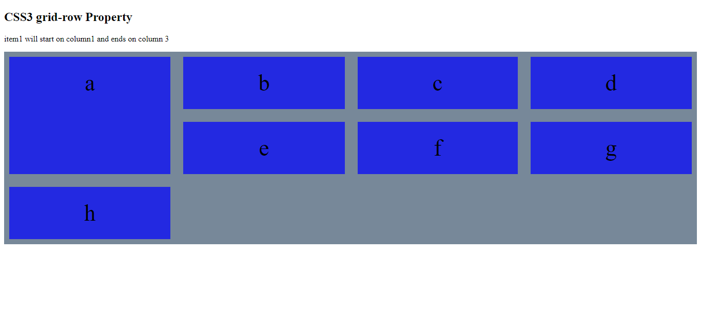
<p>item1 will start on column1 and ends on column 3</p>
<div class="grid-container">
<div class="item1">a</div>
<div class="item2">b</div>
<div class="item3">c</div>
<div class="item4">d</div>
<div class="item5">e</div>
<div class="item6">f</div>
<div class="item7">g</div>
<div class="item8">h</div>
</div>
</body>
</html>
The output of this code will be
Example of CSS3 Grid Item
<!DOCTYPE html>
<html>
<head>
<title>
CSS3 Grid Item
</title>
<style>
.grid-container {
padding: 10px;
display: grid;
grid-gap: 25px;
grid-template-columns: auto auto auto auto;
background-color: mediumseagreen;
}
.grid-container>div {
background-color: rgba(0, 255, 0, 0.7);
padding: 25px 0;
font-size: 45px;
text-align: center;
}
.item1 {
grid-row: 1/ span 3;
}
</style>
</head>
<body>
<h2> CSS3 grid-row Property </h2>
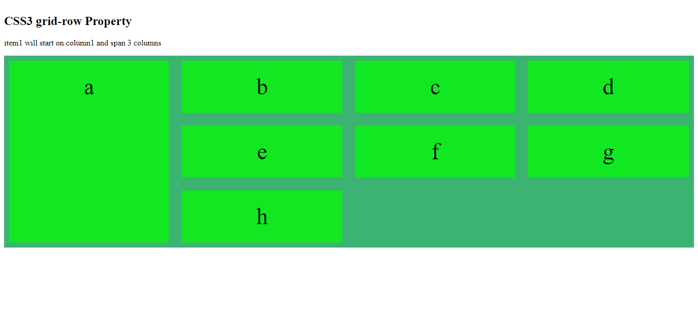
<p>item1 will start on column1 and span 3 columns</p>
<div class="grid-container">
<div class="item1">a</div>
<div class="item2">b</div>
<div class="item3">c</div>
<div class="item4">d</div>
<div class="item5">e</div>
<div class="item6">f</div>
<div class="item7">g</div>
<div class="item8">h</div>
</div>
</body>
</html>
The output of this code will be
Example
<!DOCTYPE html>
<html>
<head>
    <style>
        .grid-container {
            padding: 10px;
            display: grid;
            grid-gap: 25px;
            grid-template-columns: auto auto auto auto;
            background-color: mediumseagreen;
        }
        .grid-container>div {
            background-color: rgba(0, 255, 0, 0.7);
            padding: 25px 0;
            font-size: 45px;
            text-align: center;
        }
        .item1 {
            grid-row: 1/ span 3;
        }
    </style>
</head>
<body>
    <h2> CSS3 grid-row Property </h2>
    <p>item1 will start on row-line-1 and span 3 rows</p>
    <div class="grid-container">
        <div class="item1">a</div>
        <div class="item2">b</div>
        <div class="item3">c</div>
        <div class="item4">d</div>
        <div class="item5">e</div>
        <div class="item6">f</div>
        <div class="item7">g</div>
        <div class="item8">h</div>
    </div>
</body>
</html>
The output of this code will be
The Grid-Area Property
The ‘grid-area’ is the shorthand property for the grid-row-start, grid-column-start, grid-row-end, and grid-column-end.
Example
<!DOCTYPE html>
<html>
<head>
<style>
.grid-container {
padding: 10px;
display: grid;
grid-gap: 25px;
grid-template-columns: auto auto auto auto;
background-color: mediumseagreen;
}
.grid-container>div {
background-color: rgba(0, 255, 0, 0.7);
padding: 25px 0;
font-size: 45px;
text-align: center;
}
.item6 {
grid-area: 1/ 2 / 4 / 6;
}
</style>
</head>
<body>
<h2> CSS3 grid-area Property </h2>
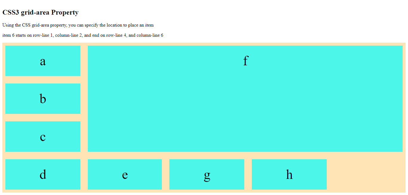
<p>Using the CSS grid-area property, you can specify the location to place an item</p>
<p>item 6 starts on row-line 1, column-line 2, and end on row-line 4, and column-line 6</p>
<div class="grid-container">
<div class="item1">a</div>
<div class="item2">b</div>
<div class="item3">c</div>
<div class="item4">d</div>
<div class="item5">e</div>
<div class="item6">f</div>
<div class="item7">g</div>
<div class="item8">h</div>
</div>
</body>
</html>
The output of this code will be
Example
<!DOCTYPE html>
<html>
<head>
<title>
CSS3 Grid Item
</title>
<style>
.grid-container {
padding: 10px;
display: grid;
grid-gap: 25px;
grid-template-columns: auto auto auto auto;
background-color: palegreen;
}
.grid-container>div {
background-color: rgba(100, 155, 105, 0.7);
padding: 25px 0;
font-size: 45px;
text-align: center;
}
.item5 {
grid-area: 2/ 1 / span 4 / span 3;
}
</style>
</head>
<body>
<h2> CSS3 grid-area Property </h2>
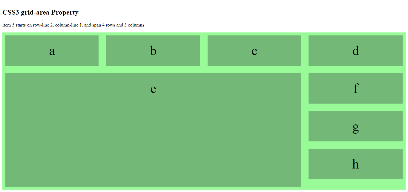
<p>item 5 starts on row-line 2, column-line 1, and span 4 rows and 3 columns</p>
<div class="grid-container">
<div class="item1">a</div>
<div class="item2">b</div>
<div class="item3">c</div>
<div class="item4">d</div>
<div class="item5">e</div>
<div class="item6">f</div>
<div class="item7">g</div>
<div class="item8">h</div>
</div>
</body>
</html>
The output of this code will be
Naming the CSS3 Grid Items
CSS3 ‘grid-area’ property assign names to grid items. We can use the grid-template-areas property to assign random names to the grid items.
Example
<!DOCTYPE html>
<html>
<head>
<title>
CSS3 Grid Item
</title>
<style>
.item2 {
grid-area: myArea;
}
.grid-container {
padding: 10px;
display: grid;
grid-template-areas: 'myArea myArea myArea myArea myArea';
grid-gap: 25px;
background-color: salmon;
}
.grid-container>div {
background-color: rgba(50, 155, 50, 0.7);
padding: 25px 0;
font-size: 45px;
text-align: center;
}
</style>
</head>
<body>
<h2> CSS3 grid-area Property </h2>
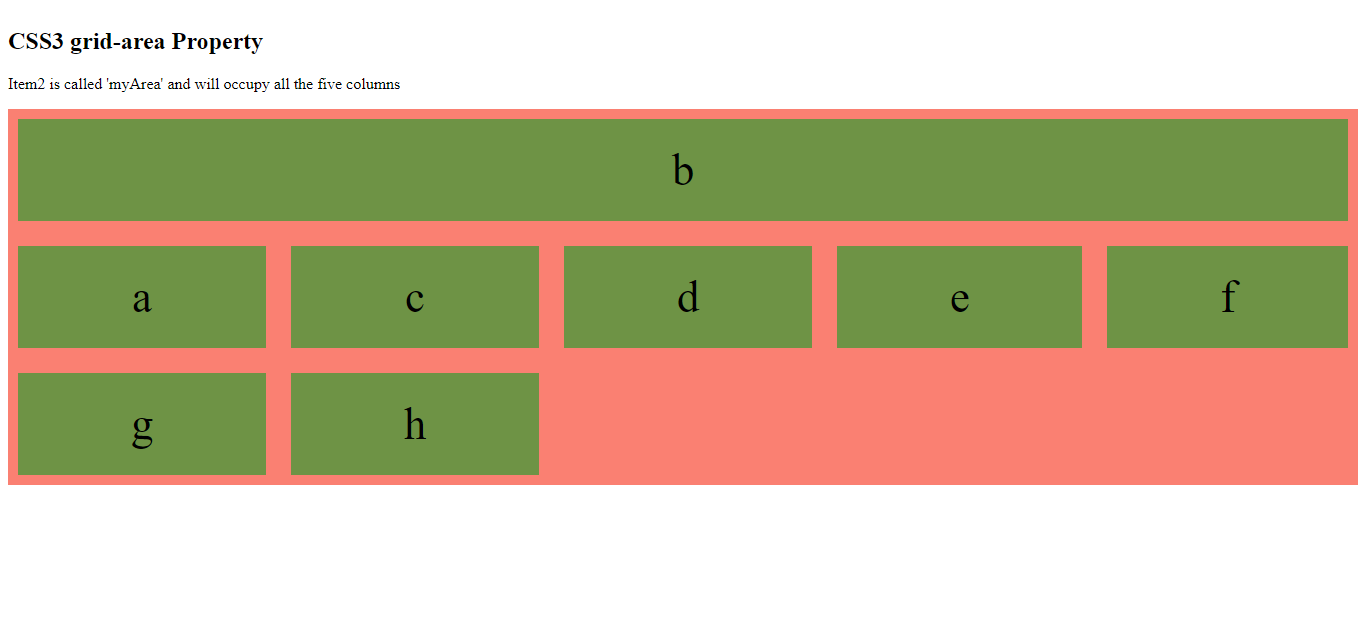
<p>Item2 is called 'myArea' and will occupy all the five columns</p>
<div class="grid-container">
<div class="item1">a</div>
<div class="item2">b</div>
<div class="item3">c</div>
<div class="item4">d</div>
<div class="item5">e</div>
<div class="item6">f</div>
<div class="item7">g</div>
<div class="item8">h</div>
</div>
</body>
</html>
The output of this code will be
In the aforementioned example, rows are represented by apostrophes (‘ ’) and columns in each row inside the apostrophes are separated by space.
Example
<!DOCTYPE html>
<html>
<head>
<title>
CSS3 Grid Item
</title>
<style>
.item1 {
grid-area: myArea;
}
.grid-container {
padding: 10px;
display: grid;
grid-template-areas: 'myArea myArea myArea ....';
grid-gap: 25px;
background-color: thistle
}
.grid-container>div {
background-color: rgba(50, 155, 90, 0.7);
padding: 25px 0;
font-size: 45px;
text-align: center;
}
</style>
</head>
<body>
<h2> CSS3 grid-area Property </h2>
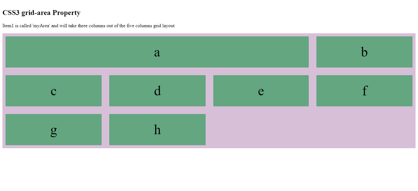
<p>Item1 is called 'myArea' and will take three columns out of the five columns grid layout</p>
<div class="grid-container">
<div class="item1">a</div>
<div class="item2">b</div>
<div class="item3">c</div>
<div class="item4">d</div>
<div class="item5">e</div>
<div class="item6">f</div>
<div class="item7">g</div>
<div class="item8">h</div>
</div>
</body>
</html>
The output of this code will be

To define two rows using the grid-area property, define the column of the second row inside another set of parenthesis.
Example
<!DOCTYPE html>
<html>
<head>
<style>
.item1 {
grid-area: myArea;
}
.grid-container {
padding: 10px;
display: grid;
grid-template-areas: 'myArea myArea ...' 'myArea myArea ....' 'myArea myArea ....';
grid-gap: 25px;
background-color: turquoise;
}
.grid-container>div {
background-color: rgba(0, 155, 90, 0.7);
padding: 25px 0;
font-size: 45px;
text-align: center;
}
</style>
</head>
<body>
<h2> CSS3 grid-area Property </h2>
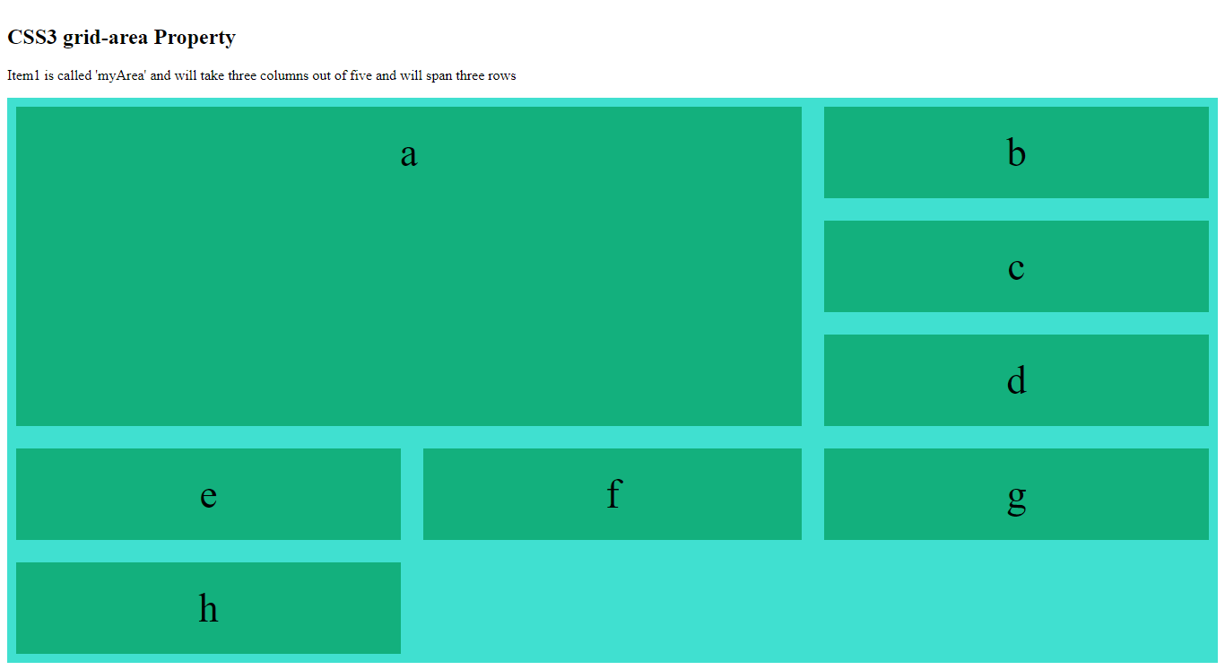
<p>Item1 is called 'myArea' and will take three columns out of five and will span three rows </p>
<div class="grid-container">
<div class="item1">a</div>
<div class="item2">b</div>
<div class="item3">c</div>
<div class="item4">d</div>
<div class="item5">e</div>
<div class="item6">f</div>
<div class="item7">g</div>
<div class="item8">h</div>
</div>
</body>
</html>
The output of this code will be
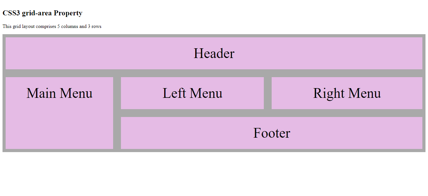
Example
Name all the items of the grid layout using the CSS ‘grid-area’ property and create a ready-to-use webpage layout.
<!DOCTYPE html>
<html>
<head>
    <style>
        .item1 {
            grid-area: header;
        }
        .item2 {
            grid-area: main-menu;
        }
        .item3 {
            grid-area: left-menu;
        }
        .item4 {
            grid-area: right-menu;
        }
        .item5 {
           grid-area: footer
        }
        .grid-container {
            padding: 10px;
            display: grid;
            grid-template-areas: 'header header header header header'
                'main-menu left-menu left-menu right-menu right-menu'
                'main-menu footer footer footer footer';
            grid-gap: 25px;
            background-color: darkgrey;
        }
        .grid-container>div {
            background-color: rgba(255, 195, 255, 0.7);
            padding: 25px 0;
            font-size: 45px;
            text-align: center;
        }
    </style>
</head>
<body>
    <h2> CSS3 grid-area Property </h2>
    <p> This grid layout comprises 5 columns and 3 rows </p>
    <div class="grid-container">
        <div class="item1">Header</div>
        <div class="item2">Main Menu</div>
        <div class="item3">Left Menu</div>
        <div class="item4">Right Menu</div>
        <div class="item5">Footer</div>
    </div>
</body>
</html>
The output of this code will be
External Sources
https://developer.mozilla.org/en-US/docs/Web/CSS/CSS_Grid_Layout/Basic_Concepts_of_Grid_Layout