
CSS3 Grid Container
CSS3 Grid Container
To convert an HTML element into a grid container, you must use CSS display property with grid value. Grid container comprises grid items displayed in the rows and columns format.
The Grid-Template-Columns Property
The grid-template-columns property specifies the number of columns in your grid layout. Moreover, it defines the width of each column.
The values assigned to grid-template-columns are space-separated, where each value specifies the width of the respective column.
If you want a grid layout with five columns, specify the width of the five columns. If all the columns share the same width, you can use the ‘auto’ value.
Example of CSS3 Grid Container
<!DOCTYPE html>
<html>
<head>
<title>
CSS3 Grid Container
</title>
<style>
.grid-container {
padding: 15px;
display: grid;
grid-gap: 15px;
grid-template-columns: auto auto auto auto auto;
background-color: orange;
}
.grid-container>div {
background-color: rgba(0, 255, 0, 0.7);
padding: 25px 0;
font-size: 45px;
text-align: center;
}
</style>
</head>
<body>
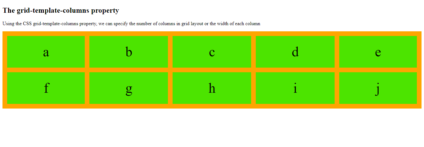
<h2> The grid-template-columns property </h2>
<p>Using the CSS grid-template-columns property, we can specify the number of columns
in grid layout or the width of each column
</p>
<div class="grid-container">
<div>a</div>
<div>b</div>
<div>c</div>
<div>d</div>
<div>e</div>
<div>f</div>
<div>g</div>
<div>h</div>
<div>i</div>
<div>j<div>
</div>
</body>
</html>
The output of this code will be
It is worth mentioning here if you have more than five items in grid columns, the grid will automatically add a row.
Example
<!DOCTYPE html>
<html>
<head>
<title>
CSS3 Grid Container
</title>
<style>
.grid-container {
padding: 15px;
display: grid;
grid-gap: 20px;
grid-template-columns: 35px 200px auto 40px;
background-color: orange;
}
.grid-container>div {
background-color: rgba(0, 255, 0, 0.7);
padding: 25px 0;
font-size: 45px;
text-align: center;
}
</style>
</head>
<body>
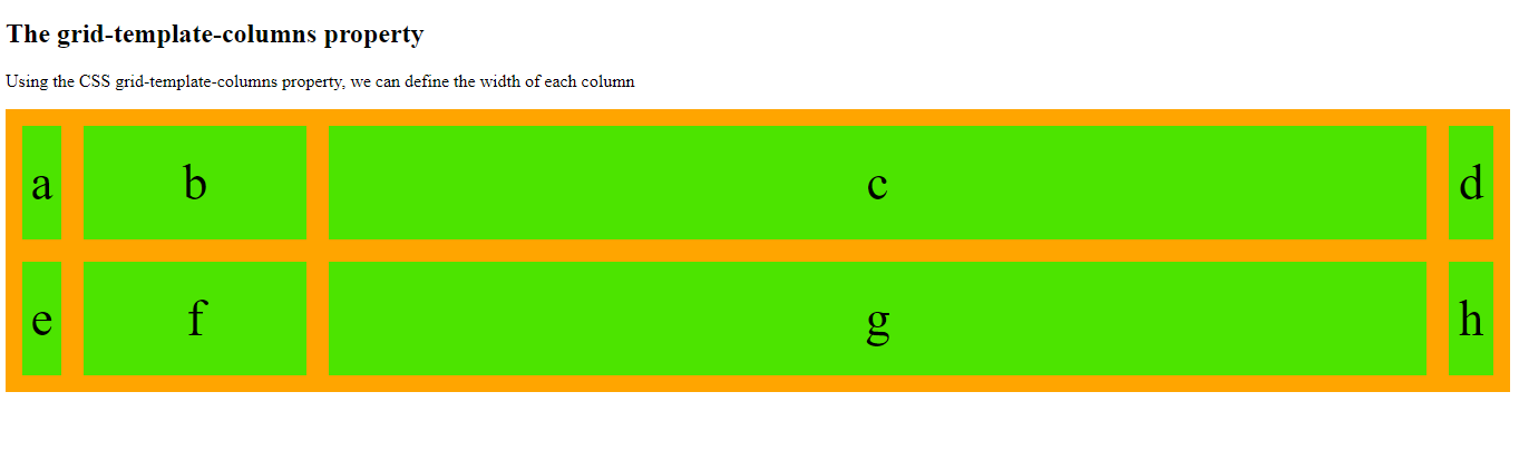
<h2> The grid-template-columns property </h2>
<p>Using the CSS grid-template-columns property, we can define the width of each column
</p>
<div class="grid-container">
<div>a</div>
<div>b</div>
<div>c</div>
<div>d</div>
<div>e</div>
<div>f</div>
<div>g</div>
<div>h</div>
</div>
</body>
</html>
The output of this code will be
The Grid-Template-Rows Property
The grid-template-rows property specifies the height of each row in a grid layout. All the values assigned to this property are space-separated, where each value defines the height of the respective row.
Example of CSS3 Grid Container
<!DOCTYPE html>
<html>
<head>
<title>
CSS3 Grid Container
</title>
<style>
.grid-container {
padding: 15px;
display: grid;
grid-gap: 20px;
grid-template-columns: auto auto auto auto;
grid-template-rows: 90px 160px;
background-color: orange;
}
.grid-container>div {
background-color: rgba(200, 0, 200, 0.7);
padding: 25px 0;
font-size: 45px;
text-align: center;
}
</style>
</head>
<body>
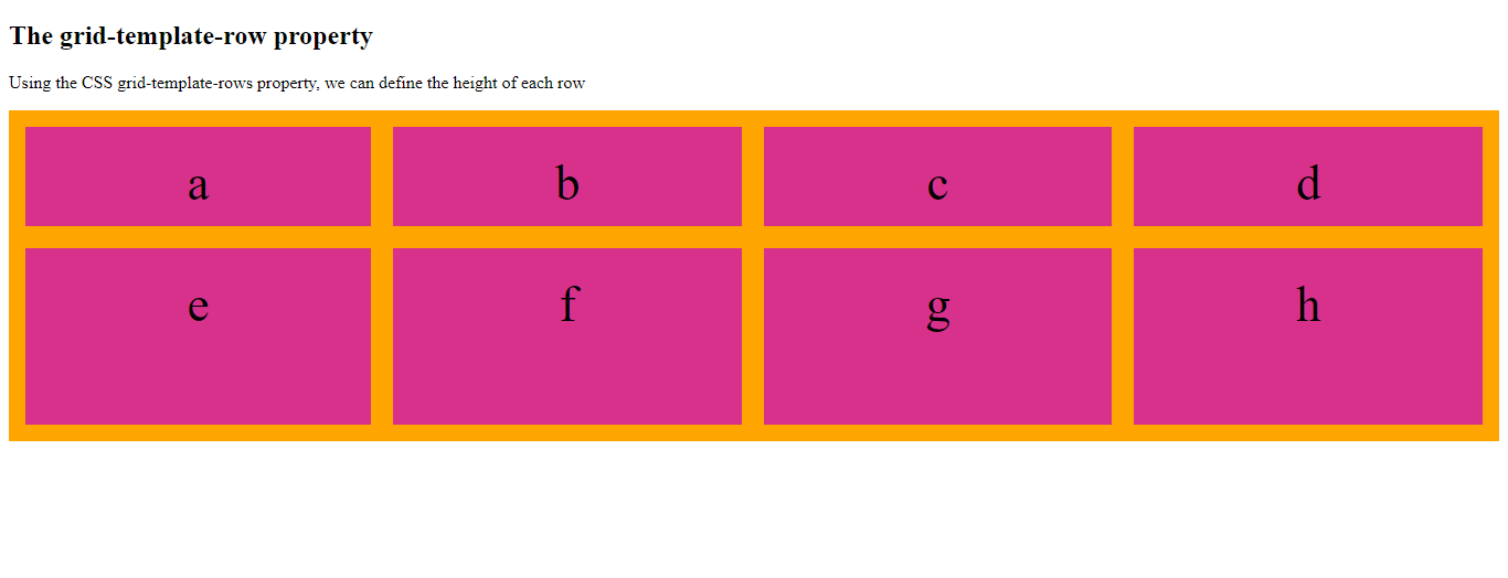
<h2> The grid-template-row property </h2>
<p>Using the CSS grid-template-rows property, we can define the height of each row
</p>
<div class="grid-container">
<div>a</div>
<div>b</div>
<div>c</div>
<div>d</div>
<div>e</div>
<div>f</div>
<div>g</div>
<div>h</div>
</div>
</body>
</html>
The output of this code will be
The Justify-Content Property
CSS justify-content property aligns an entire grid inside the container.
Example of CSS3 Grid Container
<!DOCTYPE html>
<html>
<head>
<title>
CSS3 Grid Container
</title>
<style>
.grid-container {
padding: 15px;
display: grid;
grid-gap: 20px;
grid-template-columns: 90px 90px 100px 150px;
justify-content: space-evenly;
background-color: cornflowerblue;
}
.grid-container>div {
background-color: rgba(255, 0, 255, 0.7);
padding: 25px 0;
font-size: 45px;
text-align: center;
}
</style>
</head>
<body>
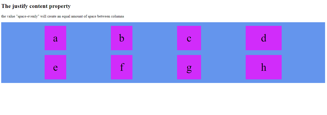
<h2> The justify content property </h2>
<p>the value "space-evenly" will create an equal amount of space between columns</p>
<div class="grid-container">
<div>a</div>
<div>b</div>
<div>c</div>
<div>d</div>
<div>e</div>
<div>f</div>
<div>g</div>
<div>h</div>
</div>
</body>
</html>
The output of this code will be
Example
<!DOCTYPE html>
<html>
<head>
<title>
CSS3 Grid Container
</title>
<style>
.grid-container {
padding: 15px;
display: grid;
grid-gap: 20px;
grid-template-columns: 90px 90px 100px 150px;
justify-content: space-around;
background-color: cornflowerblue;
}
.grid-container>div {
background-color: rgba(255, 0, 255, 0.7);
padding: 25px 0;
font-size: 45px;
text-align: center;
}
</style>
</head>
<body>
<h2> The justify content property </h2>
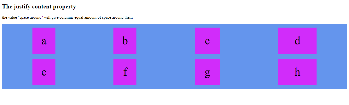
<p>the value "space-around" will give columns equal amount of space around them</p>
<div class="grid-container">
<div>a</div>
<div>b</div>
<div>c</div>
<div>d</div>
<div>e</div>
<div>f</div>
<div>g</div>
<div>h</div>
</div>
</body>
</html>
The output of this code will be
Example
<!DOCTYPE html>
<html>
<head>
<title>
CSS3 Grid Container
</title>
<style>
.grid-container {
padding: 15px;
display: grid;
grid-gap: 20px;
grid-template-columns: 90px 90px 100px 150px;
justify-content: space-between;
background-color: cornflowerblue;
}
.grid-container>div {
background-color: rgba(255, 0, 255, 0.7);
padding: 25px 0;
font-size: 45px;
text-align: center;
}
</style>
</head>
<body>
<h2> The justify content property </h2>
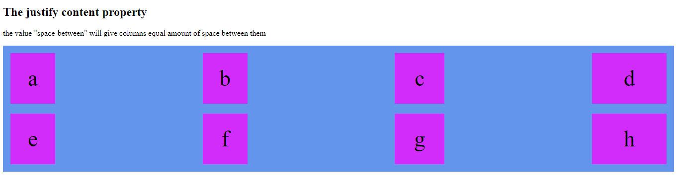
<p>the value "space-between" will give columns equal amount of space between them</p>
<div class="grid-container">
<div>a</div>
<div>b</div>
<div>c</div>
<div>d</div>
<div>e</div>
<div>f</div>
<div>g</div>
<div>h</div>
</div>
</body>
</html>
The output of this code will be
Example
<!DOCTYPE html>
<html>
<head>
<title>
CSS3 Grid Container
</title>
<style>
.grid-container {
padding: 15px;
display: grid;
grid-gap: 20px;
grid-template-columns: 90px 90px 100px 150px;
justify-content: center;
background-color: cornflowerblue;
}
.grid-container>div {
background-color: rgba(255, 0, 255, 0.7);
padding: 25px 0;
font-size: 45px;
text-align: center;
}
</style>
</head>
<body>
<h2> The justify content property </h2>
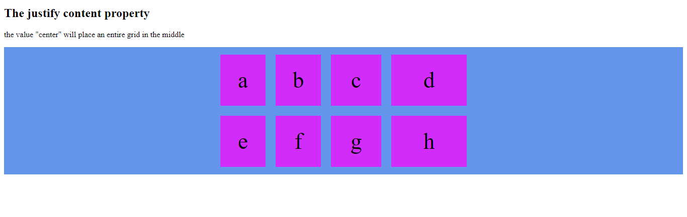
<p>the value "center" will place an entire grid in the middle</p>
<div class="grid-container">
<div>a</div>
<div>b</div>
<div>c</div>
<div>d</div>
<div>e</div>
<div>f</div>
<div>g</div>
<div>h</div>
</div>
</body>
</html>
The output of this code will be
Example
<!DOCTYPE html>
<html>
<head>
<title>
CSS3 Grid Container
</title>
<style>
.grid-container {
padding: 15px;
display: grid;
grid-gap: 20px;
grid-template-columns: 90px 90px 100px 150px;
justify-content: start;
background-color: cornflowerblue;
}
.grid-container>div {
background-color: rgba(255, 0, 255, 0.7);
padding: 25px 0;
font-size: 45px;
text-align: center;
}
</style>
</head>
<body>
<h2> The justify content property </h2>
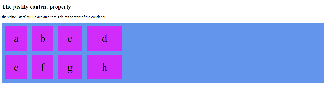
<p>the value "start" will place an entire grid at the start of the contianer</p>
<div class="grid-container">
<div>a</div>
<div>b</div>
<div>c</div>
<div>d</div>
<div>e</div>
<div>f</div>
<div>g</div>
<div>h</div>
</div>
</body>
</html>
The output of this code will be
Example
<!DOCTYPE html>
<html>
<head>
<style>
.grid-container {
padding: 10px;
display: grid;
grid-gap: 25px;
grid-template-columns: 90px 90px 100px 150px;
justify-content: end;
background-color: cyan;
}
.grid-container>div {
background-color: rgba(0, 0, 255, 0.7);
padding: 25px 0;
font-size: 45px;
text-align: center;
}
</style>
</head>
<body>
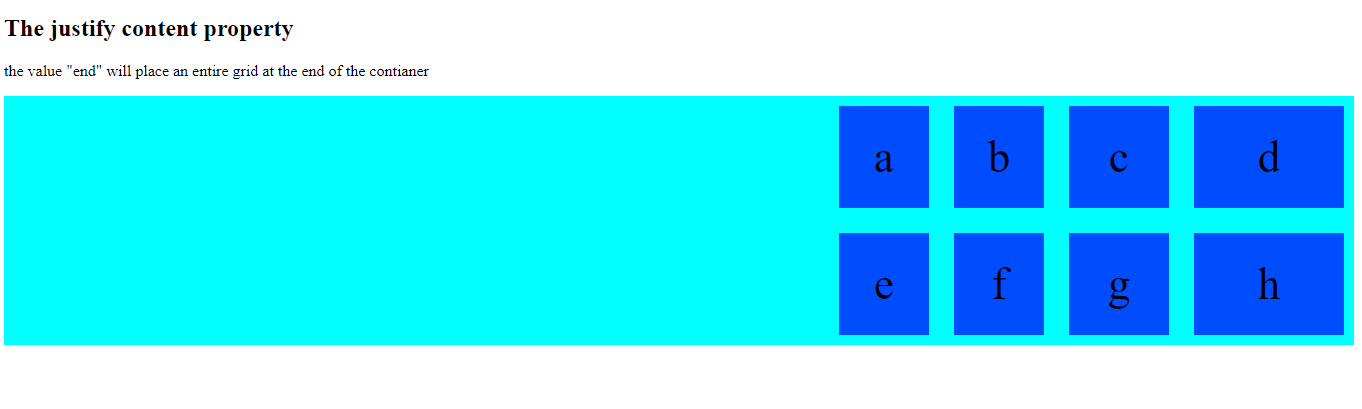
<h2> The justify content property </h2>
<p>the value "end" will place an entire grid at the end of the contianer</p>
<div class="grid-container">
<div>a</div>
<div>b</div>
<div>c</div>
<div>d</div>
<div>e</div>
<div>f</div>
<div>g</div>
<div>h</div>
</div>
</body>
</html>
The output of this code will be
The Align-Content Property of CSS3 Grid Container
The ‘align-content’ property vertically align an entire grid within the container.
Example
<!DOCTYPE html>
<html>
<head>
<title>
CSS3 Grid Layout Module
</title>
<style>
.grid-container {
padding: 10px;
display: grid;
height: 500px;
align-content: center;
grid-gap: 25px;
grid-template-columns: 90px 90px 100px 150px;
background-color: cyan;
}
.grid-container>div {
background-color: rgba(255, 0, 255, 0.7);
padding: 25px 0;
font-size: 45px;
text-align: center;
}
</style>
</head>
<body>
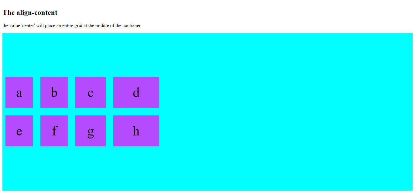
<h2> The align-content </h2>
<p>the value 'center' will place an entire grid at the middle of the contianer</p>
<div class="grid-container">
<div>a</div>
<div>b</div>
<div>c</div>
<div>d</div>
<div>e</div>
<div>f</div>
<div>g</div>
<div>h</div>
</div>
</body>
</html>
The output of this code will be
Example
<!DOCTYPE html>
<html>
<head>
<title>
CSS3 Grid Container
</title>
<style>
.grid-container {
padding: 10px;
display: grid;
height: 500px;
align-content: space-evenly;
grid-gap: 25px;
grid-template-columns: 90px 90px 100px 150px;
background-color: cyan;
}
.grid-container>div {
background-color: rgba(255, 0, 255, 0.7);
padding: 25px 0;
font-size: 45px;
text-align: center;
}
</style>
</head>
<body>
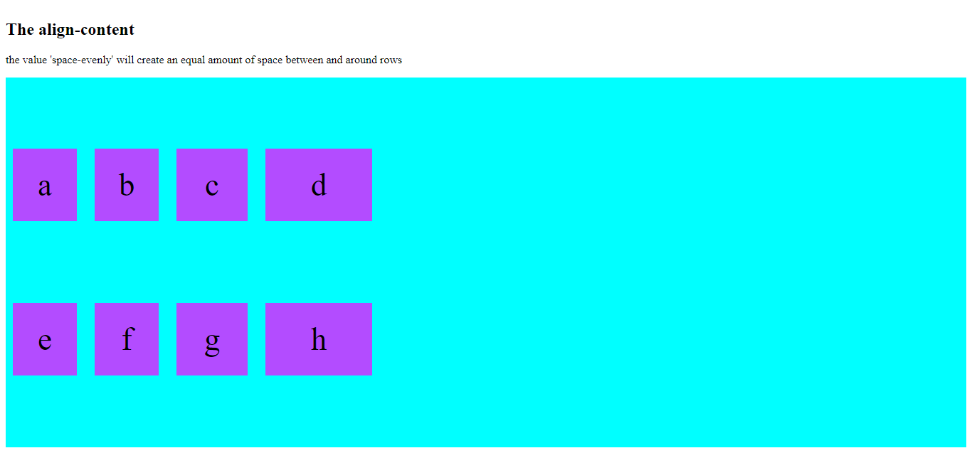
<h2> The align-content </h2>
<p>the value 'space-evenly' will create an equal amount of space between and around rows</p>
<div class="grid-container">
<div>a</div>
<div>b</div>
<div>c</div>
<div>d</div>
<div>e</div>
<div>f</div>
<div>g</div>
<div>h</div>
</div>
</body>
</html>
The output of this code will be
Example
<!DOCTYPE html>
<html>
<head>
    <style>
        .grid-container {
            padding: 10px;
            display: grid;
            height: 500px;
            align-content: space-between;
            grid-gap: 25px;
            grid-template-columns: 90px 90px 100px 150px;
            background-color: cyan;
        }
        .grid-container>div {
            background-color: rgba(255, 0, 255, 0.7);
            padding: 25px 0;
            font-size: 45px;
            text-align: center;
        }
    </style>
</head>
<body>
    <h2> The align-content </h2>
    <p>the value 'space-between' will create an equal amount of space between rows</p>
    <div class="grid-container">
        <div>a</div>
        <div>b</div>
        <div>c</div>
        <div>d</div>
        <div>e</div>
        <div>f</div>
        <div>g</div>
        <div>h</div>
    </div>
</body>
</html>
The output of this code will be
Example
<!DOCTYPE html>
<html>
<head>
<style>
.grid-container {
padding: 10px;
display: grid;
height: 500px;
align-content: start;
grid-gap: 25px;
grid-template-columns: 90px 90px 100px 150px;
background-color: darkseagreen
}
.grid-container>div {
background-color: rgba(20, 0, 255, 0.7);
padding: 25px 0;
font-size: 45px;
text-align: center;
}
</style>
</head>
<body>
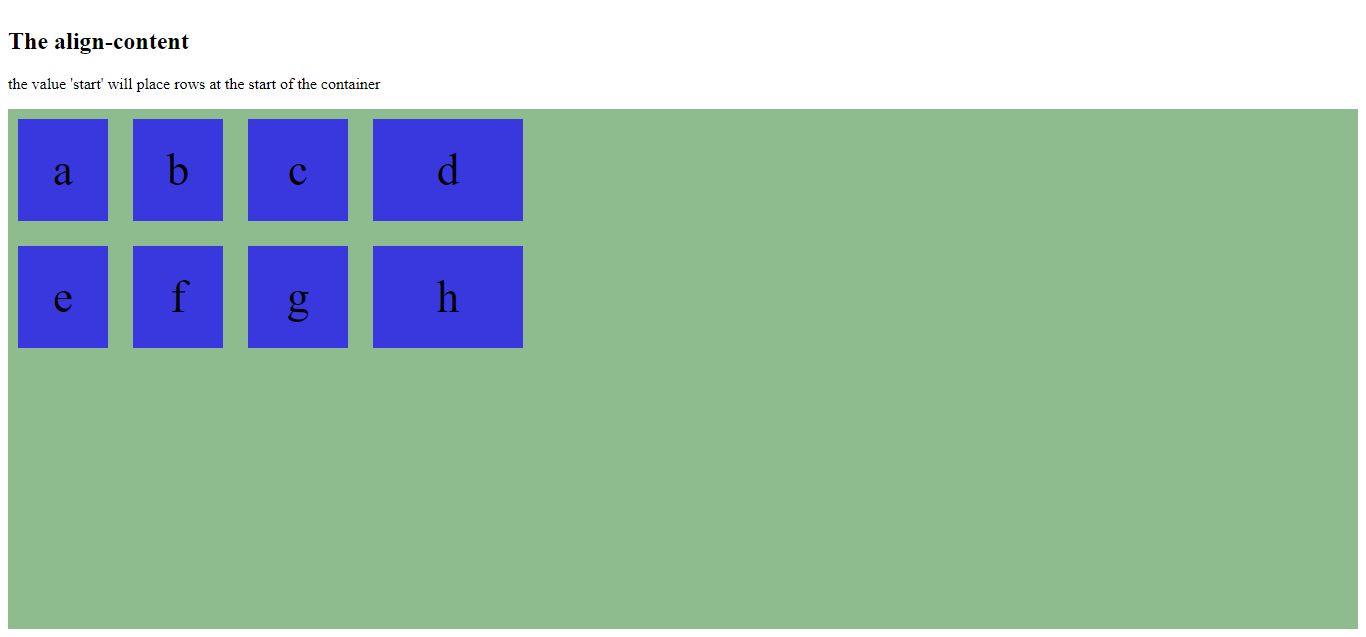
<h2> The align-content </h2>
<p>the value 'start' will place rows at the start of the container</p>
<div class="grid-container">
<div>a</div>
<div>b</div>
<div>c</div>
<div>d</div>
<div>e</div>
<div>f</div>
<div>g</div>
<div>h</div>
</div>
</body>
</html>
The output of this code will be

Example
<!DOCTYPE html>
<html>
<head>
<style>
.grid-container {
padding: 10px;
display: grid;
height: 500px;
align-content: end;
grid-gap: 25px;
grid-template-columns: 90px 90px 100px 150px;
background-color: darkseagreen
}
.grid-container>div {
background-color: rgba(20, 0, 255, 0.7);
padding: 25px 0;
font-size: 45px;
text-align: center;
}
</style>
</head>
<body>
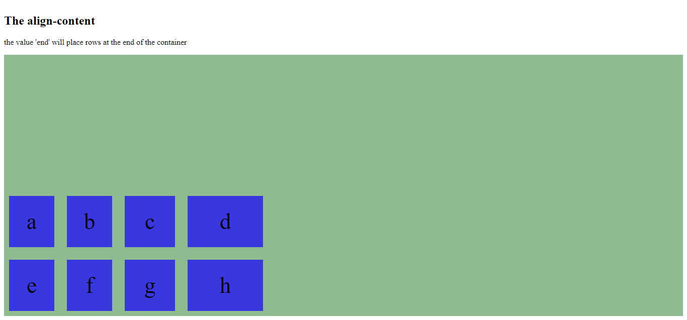
<h2> The align-content </h2>
<p>the value 'end' will place rows at the end of the container</p>
<div class="grid-container">
<div>a</div>
<div>b</div>
<div>c</div>
<div>d</div>
<div>e</div>
<div>f</div>
<div>g</div>
<div>h</div>
</div>
</body>
</html>
The output of this code will be
External Sources
https://developer.mozilla.org/en-US/docs/Web/CSS/CSS_Grid_Layout/Basic_Concepts_of_Grid_Layout