
HTML5 Responsive
HTML5 Responsive
HTML5 responsive website design technology allows you to create a website that will be cross-platform compatible. Therefore, your website will look visually appealing and adjust to the platform size on a laptop, tablet, and mobile phone.
This tutorial will teach you how to create an HTML5 responsive website design that adjusts to different sizes and viewports.
Defining the Viewport
The immediate step in creating an HTML5 responsive website is including the below-mentioned <meta> tags in all of your web pages.
<meta name=”viewport” content=”width=device-width, initial-scale=1.0”>
This meta tag specifies the viewport of your page and instructs the browser on how to control the page’s dimension as the device’s width changes.
Responsive Images
Responsive images adjust themselves according to the browser size.
Specifying the Width Property
If we assign the value 100% to the width property, image will remain responsive irrespective of the device’s width.
<!DOCTYPE html>
<html>
<head>
    <meta charset="UTF-8">
    <meta name="viewport" content="width = device-width, initial-scale=1.0">
    <title>HTML5 Responsive Website Design</title>
</head>
<body>
    <img src="Jackets.jpg" style="width=100%;">
    <h2>HTML5 Responsive Images</h2>
    <p>When the widht property is set in percentage, the image will scale up and down itself depending on the browser
        window.
        To visualize this effect, resize the browser window.</p>
</body>
</html>
The Output of this code will be

It is worth mentioning that the above example image can be stretched greater than its original size. For this reason, we recommend using the max-width property.
Using the max-width Property
If we assign the value 100% to the max-width Property, the image will scale down if required but never scales up greater than its actual size.
<!DOCTYPE html>
<html>
<head>
    <meta charset="UTF-8">
    <meta name="viewport" content="width = device-width, initial-scale=1.0">
    <title>HTML5 Responsive Website Design</title>
</head>
<body>
    <img src="Jackets.jpg" style="max-width=100%; height:auto;">
    <h2>HTML5 Responsive Images</h2>
    <p>When the widht property is set in percentage, the image will scale up and down itself depending on the browser
        window.
        To see how it works, just resize the browser window.</p>
</body>
</html>
The Output of this code will be
Responsive Text Sizes
“VW” specifies text width that represents viewport. In this way, the text size will follow the size of the viewport width.
Example
<!DOCTYPE html>
<html>
<head>
<meta charset="UTF-8">
<meta name="viewport" content="width = device-width, initial-scale=1.0">
<title>HTML5 Responsive Website Design</title>
</head>
<body>
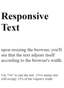
<h1 style="font-size: 15vw;">Responsive Text</h1>
<p style="font-size: 7vw;">upon resizing the browser, you'll see that the text adjusts itself according to the
browser's width</p>
<p style="font-size: 5vw;">Use "vw" to size the text. 15vw means text will occupy 15% of the vieport's widht</p>
<p style="font-size: 5vw;">Lorem ipsum dolor sit amet consectetur adipisicing elit. Voluptas tempora perferendis,
nobis ratione, illum voluptatem corporis reprehenderit debitis velit vero laudantium, ut laborum. Ullam odio
commodi animi esse iusto impedit.</p>
</body>
</html>
The output of this code will be
Using Media Queries
Aside from resizing the text and images, web developers also use media queries to make web pages responsive. With media queries, you can define different styles for your web pages as the device length changes.
<!DOCTYPE html>
<html>
<head>
<meta charset="UTF-8">
<meta name="viewport" content="width = device-width, initial-scale=1.0">
<title>HTML5 Responsive Website Design</title>
<style>
* {
box-sizing: border-box;
}
.left {
background-color: blanchedalmond;
padding: 25px;
float: left;
width: 30%;
}
.main {
background-color: brown;
padding: 25px;
float: left;
width: 30%;
}
.right {
background-color: chocolate;
padding: 25px;
float: left;
width: 30%;
}
/* We are using media query to add breakpoint at 600px */
@media screen and (max-width:600px) {
.left,
.main,
.right {
width: 100%;
/* the width will be 100% when the viewport is 600px */
}
}
</style>
</head>
<body>
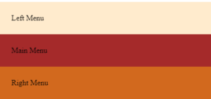
<div class="left menu">
Left Menu
</div>
<div class="main">
Main Menu
</div>
<div class="right">
Right Menu
</div>
</body>
</html>
The output of this code will be
Bootstrap
Another way to make your website responsive is to add popular CSS framework Bootstrap in your HTML document.
Example
<!DOCTYPE html>
<html>
<head>
<meta charset="UTF-8">
<meta name="viewport" content="width = device-width, initial-scale=1.0">
<link rel="stylesheet" href="https://maxcdn.bootstrapcdn.com/bootstrap/3.4.1/css/bootstrap.min.css">
<script src="https://ajax.googleapis.com/ajax/libs/jquery/3.5.1/jquery.min.js"></script>
<script src="https://maxcdn.bootstrapcdn.com/bootstrap/3.4.1/js/bootstrap.min.js"></script>
<title>HTML5 Responsive Website Design</title>
</head>
<body>
<div class="container">
<div class="jumbotron">
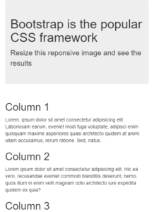
<h1>Bootstrap is the popular CSS framework</h1>
<p>Resize this reponsive image and see the results</p>
</div>
<div class="row">
<div class="col-sm-4">
<h2>Column 1</h2>
<p>Lorem, ipsum dolor sit amet consectetur adipisicing elit. Laboriosam earum, eveniet modi fuga
voluptate, adipisci enim quisquam maxime asperiores quasi architecto quidem at animi ullam
accusamus, rerum ratione. Sed, natus.</p>
</div>
<div class="col-sm-4">
<h2>Column 2</h2>
<p>Lorem ipsum dolor sit amet consectetur adipisicing elit. Hic ea vero, recusandae eveniet commodi
blanditiis deserunt, nemo, quos illum in enim velit magnam odio architecto iure expedita quidem ex
quia?</p>
</div>
<div class="col-sm-4">
<h2>Column 3</h2>
<p>Lorem ipsum dolor sit amet, consectetur adipisicing elit. Sint eveniet minima voluptatem placeat!
Explicabo totam numquam minima delectus. Accusamus omnis itaque deserunt pariatur magni dignissimos,
quo est deleniti aliquid eum!</p>
</div>
</div>
</div>
</body>
</html>
The output of this code will be
To know more about styling HTML elements, visit https://www.vishacademy.com