
HTML5 Website Layout
HTML5 Website Layout
You must have gone through many websites that display content in a magazine or newspaper format. In this HTML5 website layout tutorial, we’ll teach you how you can apply the same format to your website,
HTML5 Website Layout Elements
HTMl5 has introduced many semantic elements that completely define different parts of our webpage.
- <header>: Highlights header for a document or section
- <nav>: Defines a list of navigational links.
- <section>: Specifies a section(s) in a document
- <article>: Represents self-contained and independent content.
- <aside>: Defines a piece of content that is distinguishable from the main content.
- <footer>: Specifies a footer for an HTML document
- <details>: Provides additional details to the users.
- <summary>: Assigns heading to the <details> element.
You can learn more about the semantic elements in our semantic elements section.
HTML5 Website Layout Techniques
There are four main techniques to create a multi-column layout. Each technique has some upsides and downsides.
- CSS framework
- CSS float property
- CSS flexbox
- CSS grid
CSS frameworks
To structure your website layout fast, you can leverage CSS frameworks like Bootstrap, skeleton CSS, Semantic UI, Foundation, Bulma CSS, Materialize, or UIkit.
CSS Float Property
Many web developers use CSS float property to create a website layout as they are easy to learn and apply. To apply them appropriately, all you need to do is make strong foundations of CSS float and clear properties.
A major setback in using CSS float is that floating elements are strongly attached to the document, sometimes harming flexibility.
Code Example
<!DOCTYPE html>
<html>
<head>
<meta charset="UTF-8">
<meta name="viewport" content="width = device-width, initial-scale=1.0">
<style>
* {
box-sizing: border-box;
}
body {
font-family: Georgia, 'Times New Roman', Times, serif;
}
/*decorate the header*/
header {
background-color: greenyellow;
padding: 25px;
text-align: center;
font-size: 25px;
color: white;
}
nav {
float: left;
width: 30%;
background-color: turquoise;
height: 350px;
padding: 30px;
}
nav ul {
list-style-type: none;
padding: 0;
}
article {
float: left;
padding: 30px;
width: 70%;
background-color: darkgray;
height: 350px;
}
/* clear float*/
section:after {
content: "";
display: table;
clear: both;
}
/*decorate the footer */
footer {
background-color: deepskyblue;
padding: 30px;
text-align: center;
color: white;
}
/* all the columns will stack on each other as the width of the tab becomes 540px */
@media (max-width:540px) {
nav,
article {
width: 100%;
height: auto;
}
}
</style>
</head>
<body>
<h1>CSS Float Property</h1>
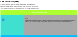
<p>In this code snippet, we are HTML5 semantic element header, section, and footer</p>
<p>Using these semantic elements, we have created one header, two columns, and one footer</p>
<p>As you resize the browser tab, you'll see that both column will vertically stack on eack other</p>
<header>
Programming Languages
</header>
<section>
<nav>
<ul>
<li><a href="#">C++</a></li>
<li><a href="#">Python</a></li>
<li><a href="#">Java</a></li>
</ul>
</nav>
<article>
<h1>C++</h1>
<p>Lorem ipsum, dolor sit amet consectetur adipisicing elit. Porro, accusamus tempora iste totam rem quo,
cupiditate esse officiis ut nihil accusantium ratione molestiae neque dignissimos consequuntur facilis
quod eveniet doloribus!</p>
</article>
</section>
<footer>Visit Vish Academy to learn these langauges</footer>
</body>
</html>
The output of this code will be
Resized Image
CSS Flexbox Layout
CSS flexbox layout ensures that our webpage looks perfectly well on different screen sizes
Example
<!DOCTYPE html>
<html>
<head>
<meta charset="UTF-8">
<meta name="viewport" content="width = device-width, initial-scale=1.0">
<style>
* {
box-sizing: border-box;
}
body {
font-family: Verdana, Geneva, Tahoma, sans-serif;
}
/* Style the header */
header {
background-color: burlywood;
padding: 40px;
text-align: center;
font-size: 45px;
color: white;
}
/* Container for flexboxes */
section {
display: -webkit-flex;
display: flex;
}
/* Style the navigation menu */
nav {
-webkit-flex: 1;
-ms-flex: 1;
flex: 1;
background-color: cyan;
padding: 20px;
}
/* Style the list inside the menu */
nav ul {
list-style-type: none;
padding: 0;
}
/* Style the content */
article {
-webkit-flex: 3;
-ms-flex: 3;
flex: 3;
background-color: yellowgreen;
padding: 50px;
}
/* Style the footer */
footer {
background-color: silver;
padding: 30px;
text-align: center;
color: white;
font-weight: bold;
}
/* Responsive layout - makes the menu and the content (inside the section) sit on top of each other instead of next to each other */
@media (max-width: 600px) {
section {
-webkit-flex-direction: column;
flex-direction: column;
}
}
</style>
</head>
<body>
<h1>CSS Flexbox Layout</h1>
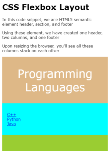
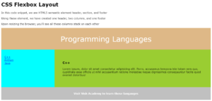
<p>In this code snippet, we are HTML5 semantic element header, section, and footer</p>
<p>Using these element, we have created one header, two columns, and one footer</p>
<p>Upon resizing the browser, you'll see all these columns stack on each other</p>
<header>
Programming Languages
</header>
<section>
<nav>
<ul>
<li><a href="#">C++</a></li>
<li><a href="#">Python</a></li>
<li><a href="#">Java</a></li>
</ul>
</nav>
<article>
<h1>C++</h1>
<p>Lorem ipsum, dolor sit amet consectetur adipisicing elit. Porro, accusamus tempora iste totam rem quo,
cupiditate esse officiis ut nihil accusantium ratione molestiae neque dignissimos consequuntur facilis
quod eveniet doloribus!</p>
</article>
</section>
<footer>Visit Vish Academy to learn these langauges</footer>
</body>
</html>
The output of this code will be
On a Resize Tab
CSS Grid Layout
CSS grid layout provides a grid-based layout system for designing a webpage layout with rows and columns. With a CSS grid, you don’t have to use floats and positioning.
We won’t discuss the CSS grid here as it is a complicated topic; navigate our CSS tutorials to learn more about it.